Inspired: Bill Peet, An Autobiography

I’m starting a series of posts to highlight some of my favorite authors and illustrators. It’s an attempt to verbalize what I love about each and to think through how they’ve influenced my own process. I’m not sure what’ll come of this, but here we go.

In our first installment, Bill Peet.

Bill Peet started out as an animation in-betweener at Disney, became a storyboard artist and writer, and eventually launched a career as an author/illustrator when he grew frustrated at Disney.

Peet wrote many wonderful books, including Huge Harold, Chester the Worldly Pig, and Cyrus the Unsinkable Sea Serpent. But my favorite is Bill Peet: An Autobiography.

IMG_0933.png

Peet’s writing is straightforward and his illustrations are spot on. I love his lively line work. I’ve spoken about this before, but one of my goals as an illustrator has always been to capture the freshness of the original sketch in the final artwork. Peet does this beautifully.

IMG_0923.png
IMG_0925.png
IMG_0927.png

I also really love Peet’s pencil shading. Interior illustrations now don’t have enough of this scratchy look. I really want to incorporate more of this fun into my own work.

Peet’s able to brooch darker subjects like depression, disappointment, and death while retaining a sense of joy and humor. It’s a line many of my favorite illustrators are able to walk.

IMG_0932.png

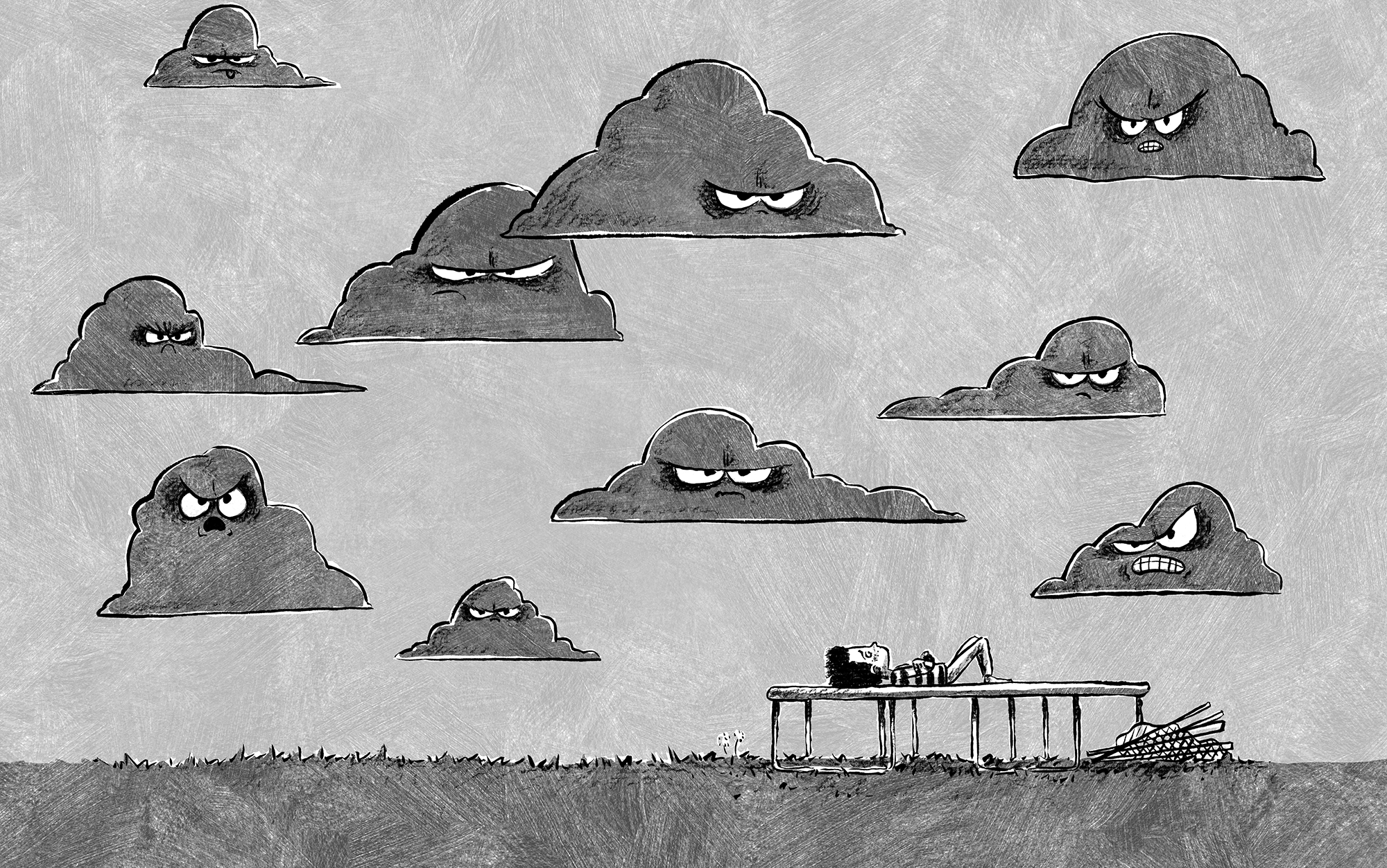
You may know that I’ve been illustrating Annie Barrows’ hilarious series, Iggy. I’ve been trying to capture the energy of Iggy through illustration, and some of my inspiration comes from Peet’s work. The editor and art director wanted Iggy’s illustrations to feel raw and lively. They pushed me quite a bit further than my initial concept sketches, towards a style where I used a dry brush pen and Faber Castell pencil on really rough watercolor paper, then shaded and added textures I’d scanned into the computer. I’m happy with the finished result, though it’s still hard for me to accept the fact that others won’t believe I did this on purpose. I still fear the “I could draw better than that!” comments I hear when people talk about Quentin Blake’s illustrations. (And no, you couldn’t.)

16.png
10.png
130-131.png

So, check out Bill Peet. You and your kids will love it for its personal take on Disney history and its easy-to-read text with delightful illustrations on every page.

Gingerbread in January

My wife’s family does a gingerbread decorating competition each year. Normally, we do the contest before Christmas, but this year it got pushed to January, and we did it via Zoom. 

The contest rules?

  • The house must be edible

  • The house must be made within an hour

  • Elements of the house can be made in advance, but construction cannot begin until the timer is set

The competition’s fierce. There’ve been hobbit holes, a Millennium Falcon, an abominable snow monster—you name it. In the 8 years we’ve done the contest, Janae and I have won just once. 

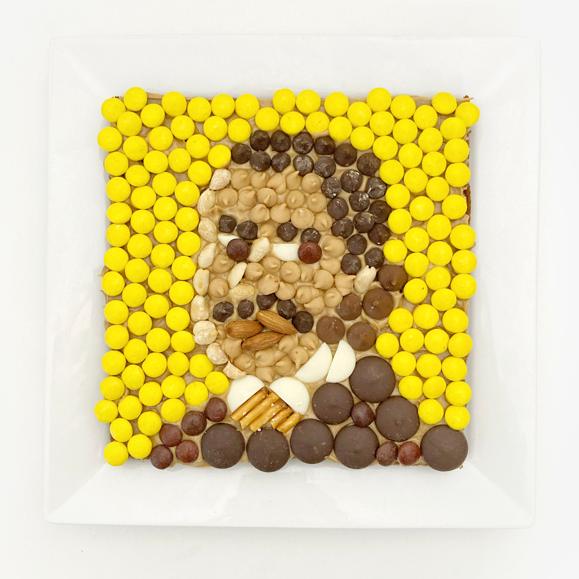
Since this year’s competition happened in January, we went with a Martin Luther King theme. We didn’t win, but I’m proud to say ours was 1) actually made of gingerbread, and 2) the most eaten entry of the bunch (likely because of the Reese’s Pieces).

IMG_4187.png

Here are the year’s other entries. The one of the garage (bottom right) won, in case you’re curious. It’s an inside family joke. 🍪

IMG_1923.png

A Convo with Annie Barrows

A couple of months ago, I sat down with Annie Barrows to discuss our newest book, Iggy Is Better Than Ever, for UVU’s annual For the Love of Reading event. If you’re interested in a meandering exploration of process and inspiration, plus a look at Annie’s stellar drawings, you’ve come to the right place. 👇

"Book Talk: Iggy Is Better Than Ever" - Annie Barrows and Sam Ricks Join this session to hear Annie Barrows, author of the Ivy and Bean series and Sam Ricks,...

Aprons and Such

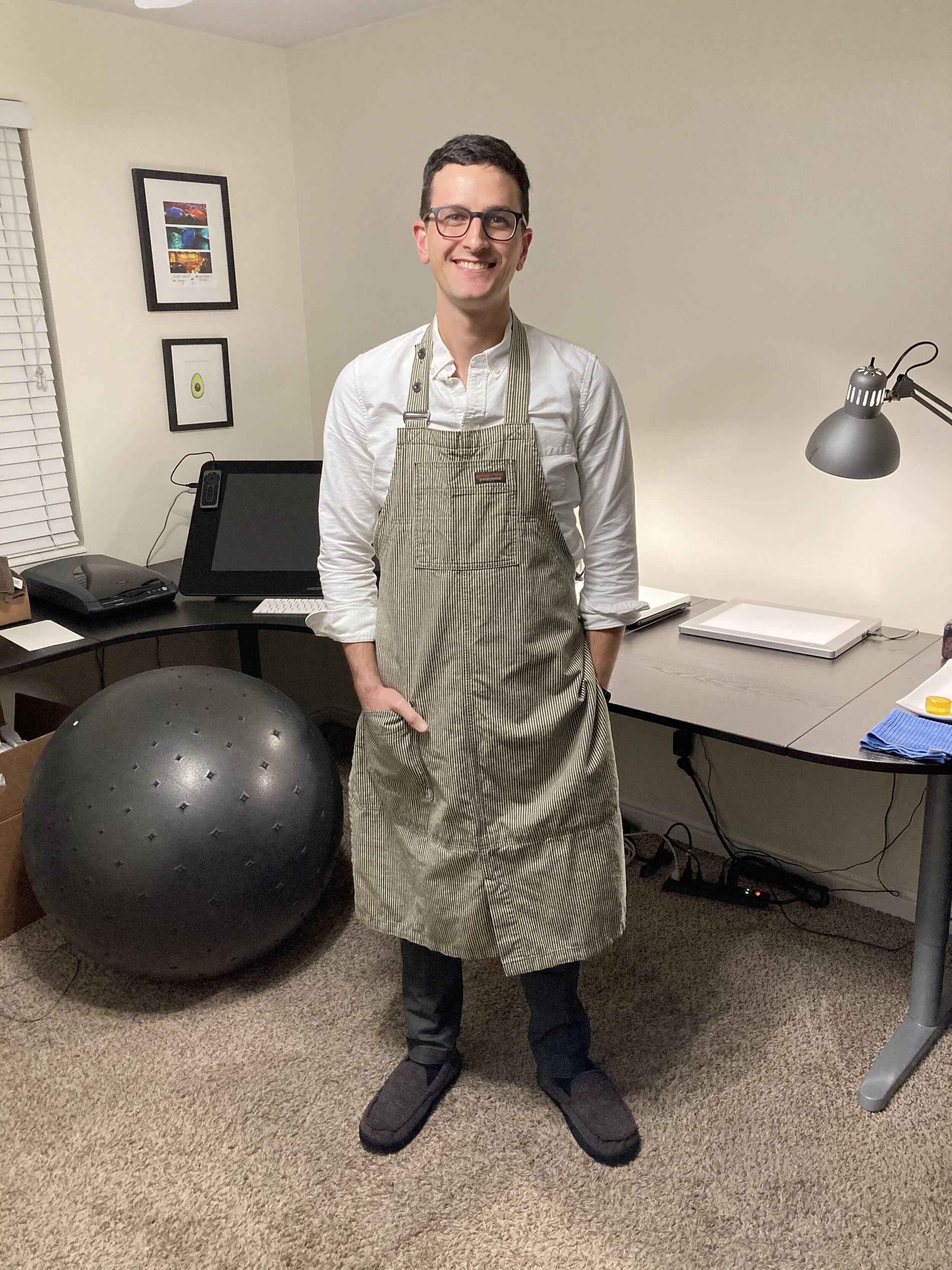
This year, I got a work apron for Christmas. I’ve always loved the idea (passed on to me by Dr. Seuss and Mr. Rogers) of changing outfits when moving into the creative zone. A couple of years ago, I saw a documentary about Miyazaki where he wore a simple apron to keep clean while working. I’ve copied him. So far, the apron’s been awesome. It helps me focus on what I’m in the studio to do, it helps my family know when I’m “in the zone”, and I have to say, it looks pretty great. Thanks, Janae!

IMG_4020.JPG

POTUS Project

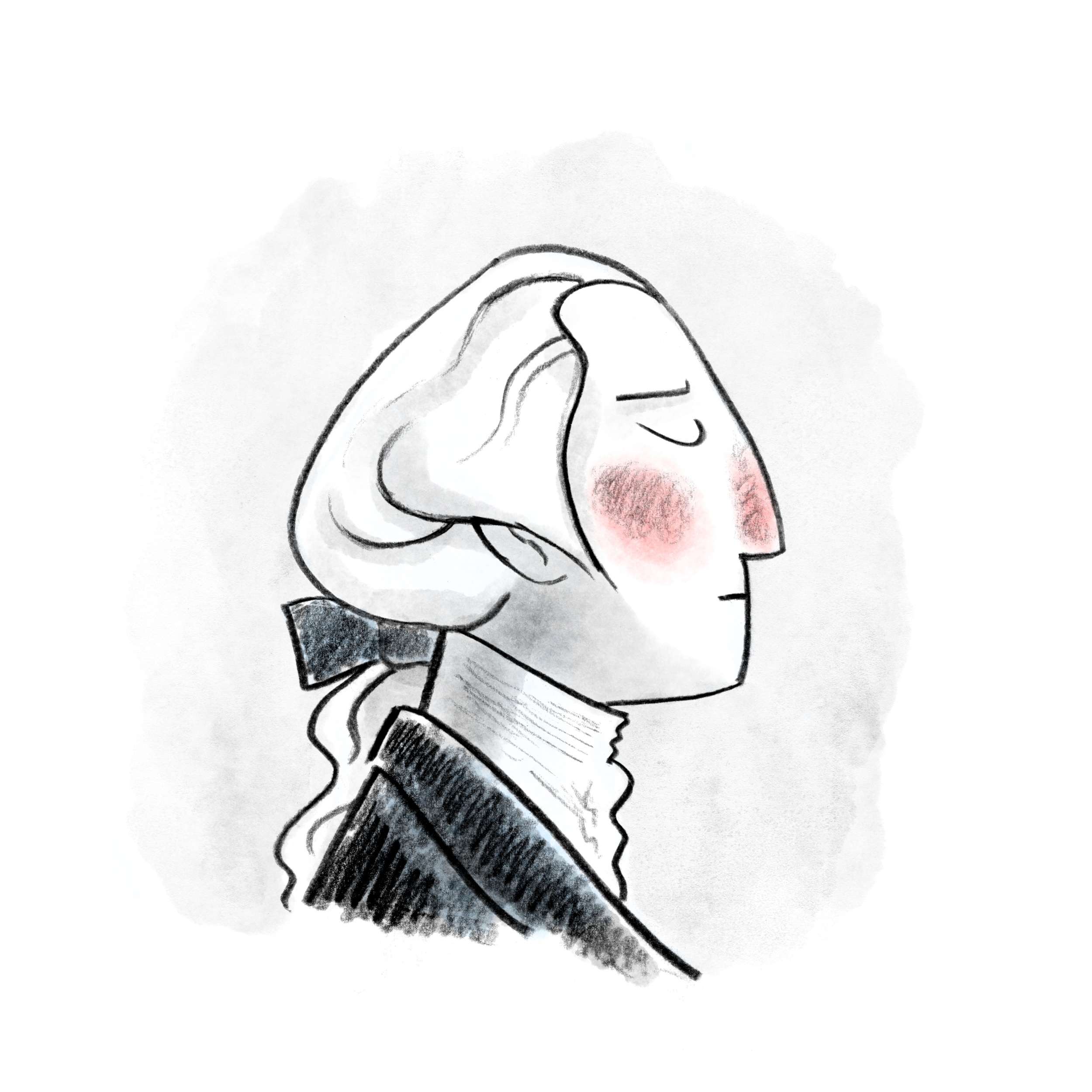
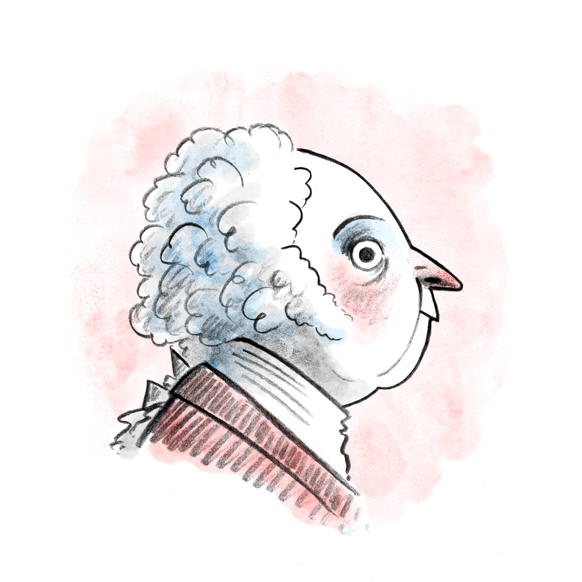
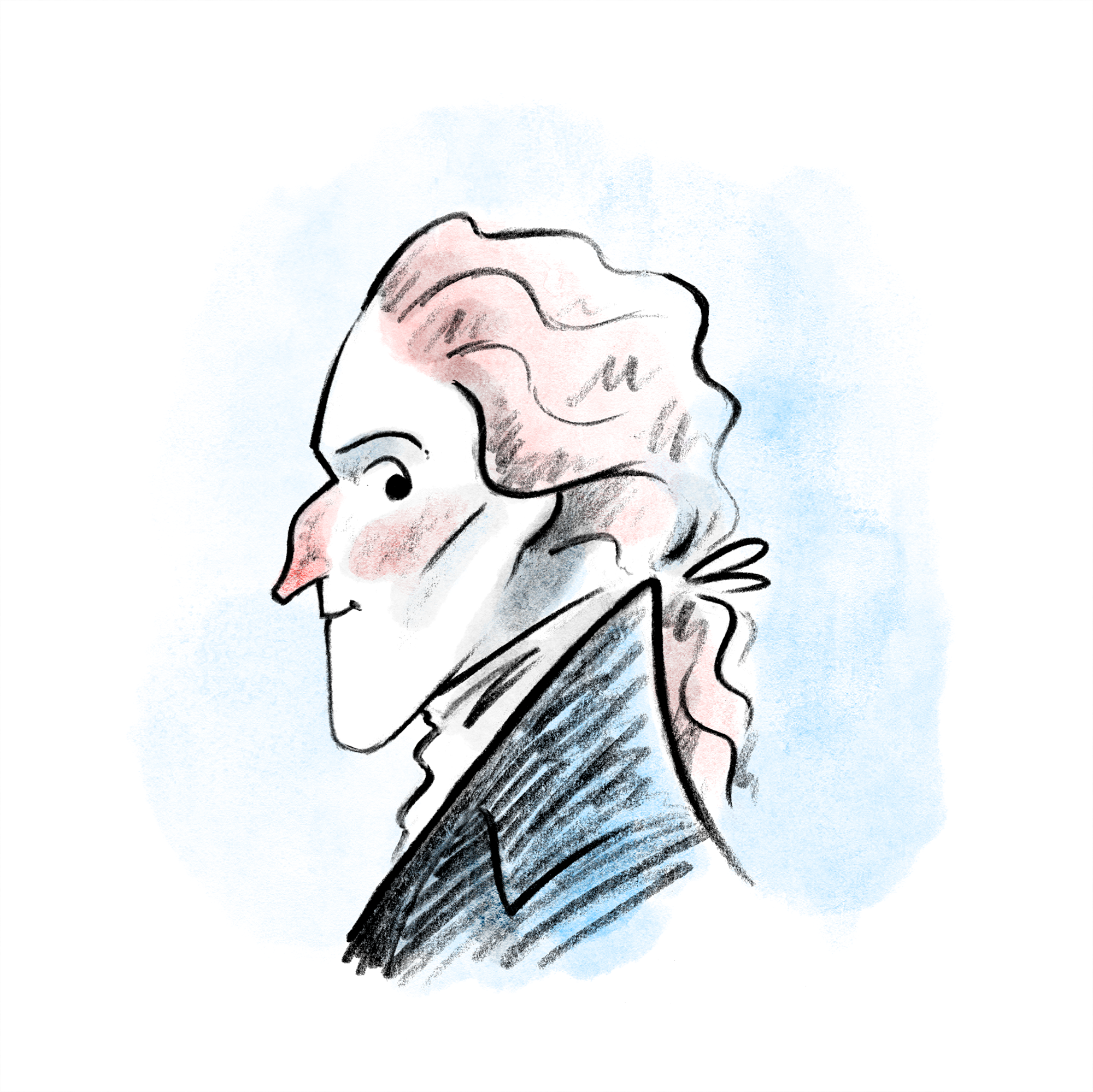
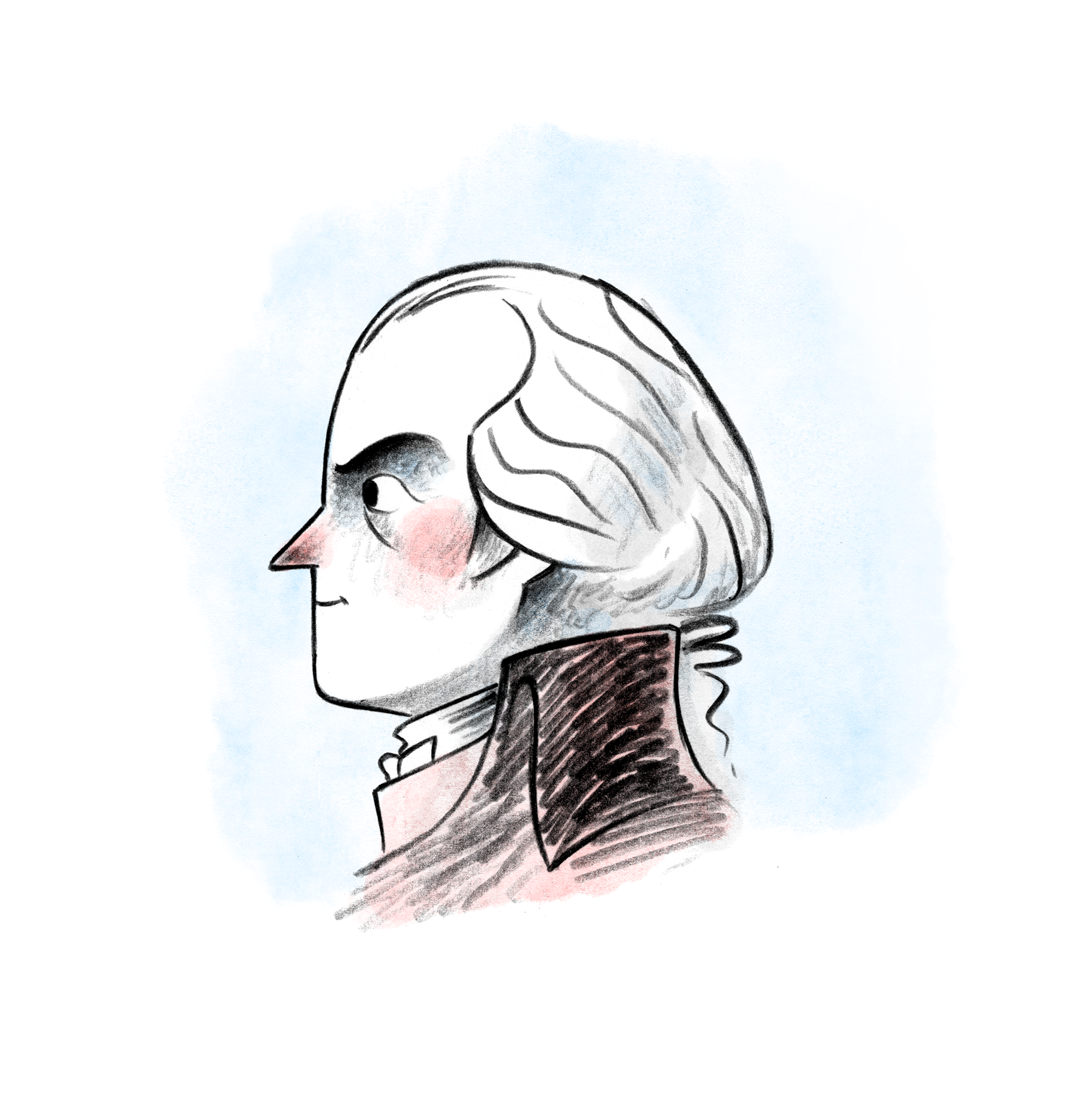
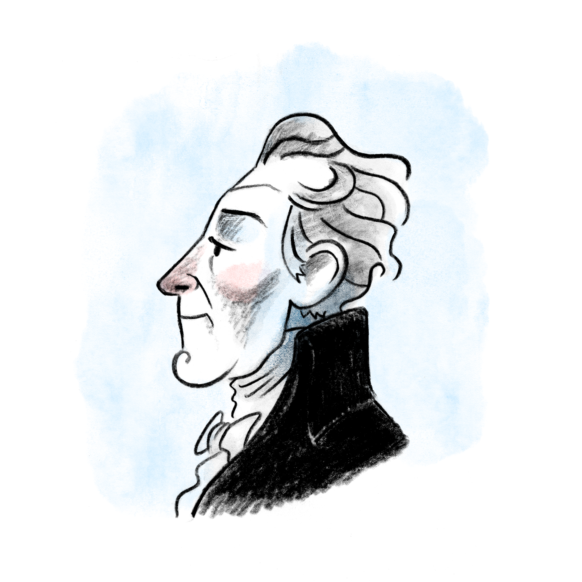
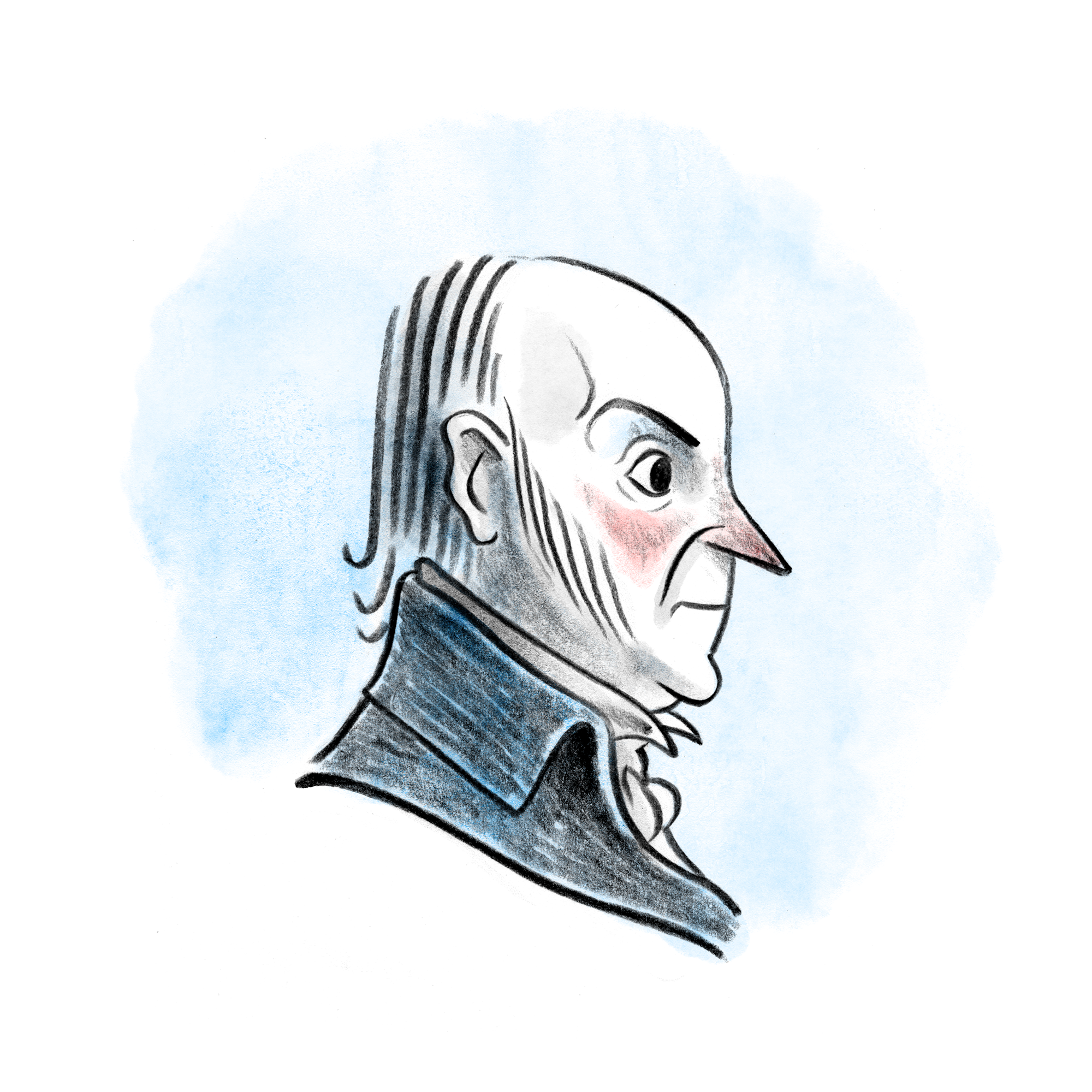
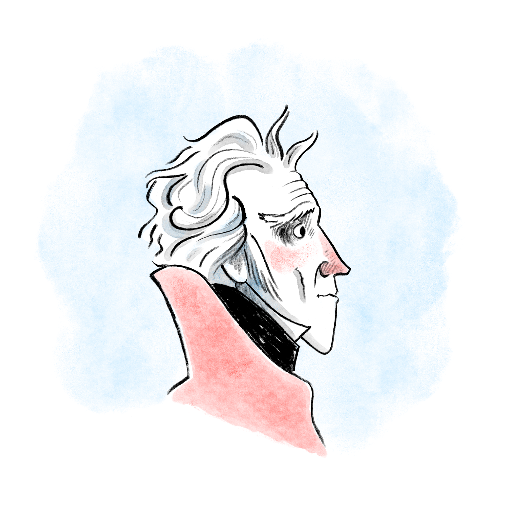
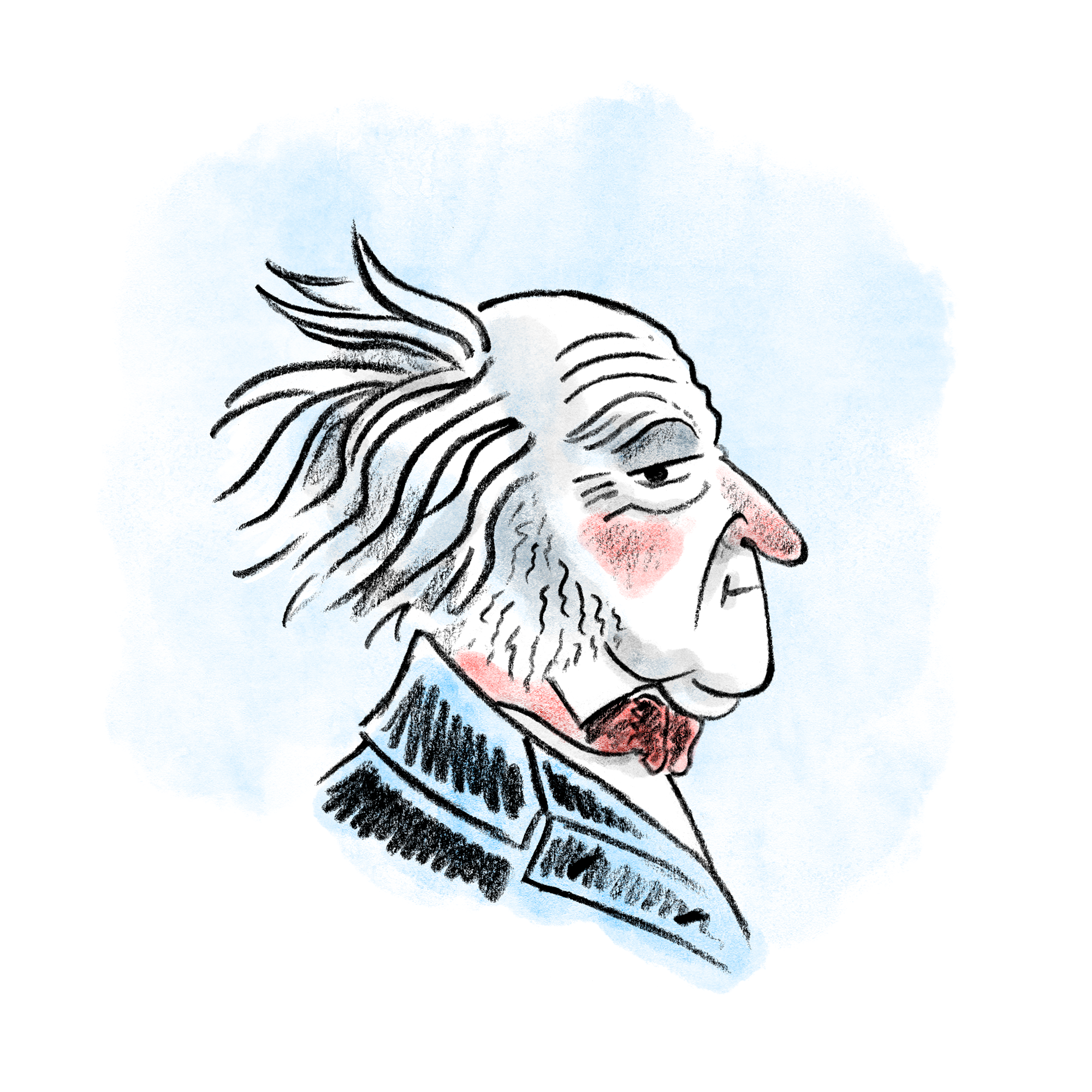
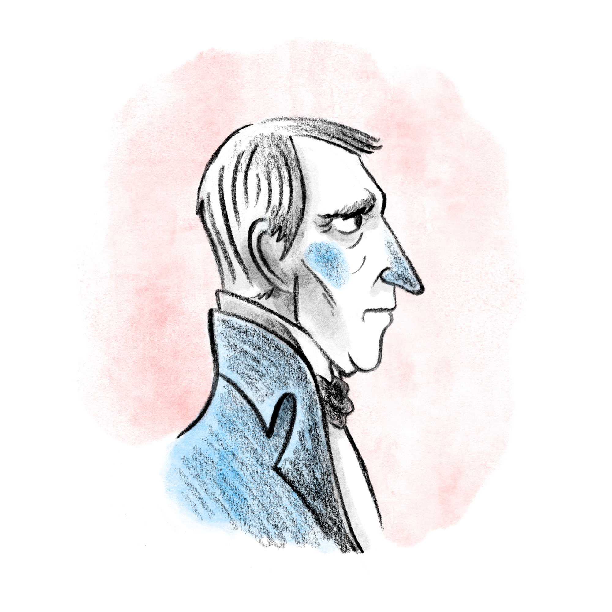
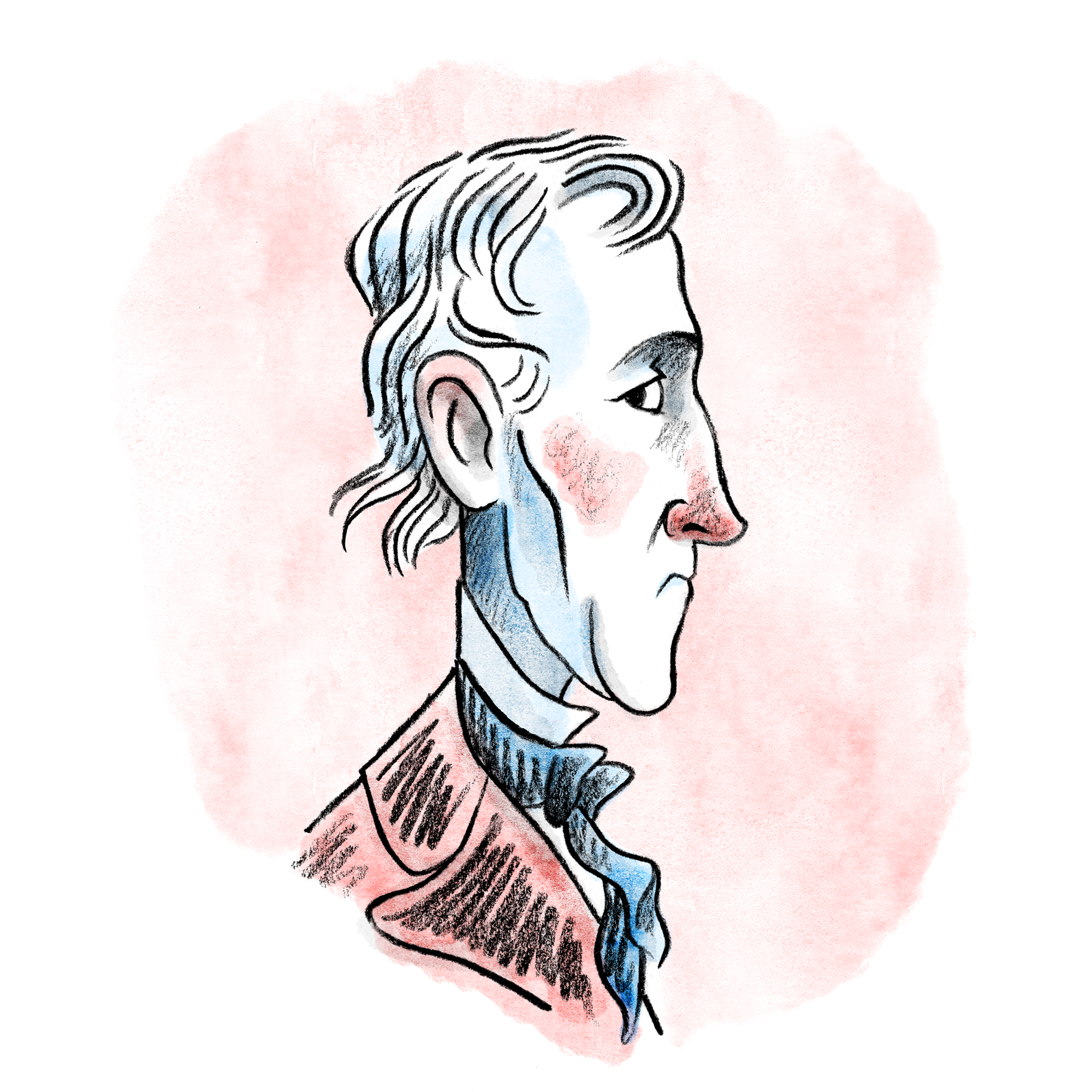
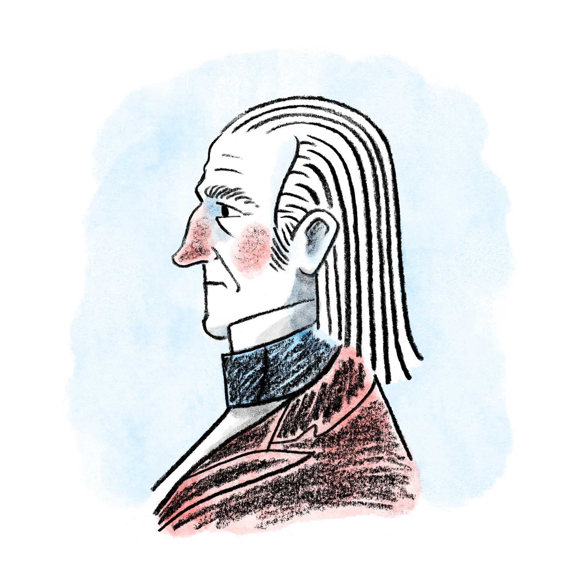
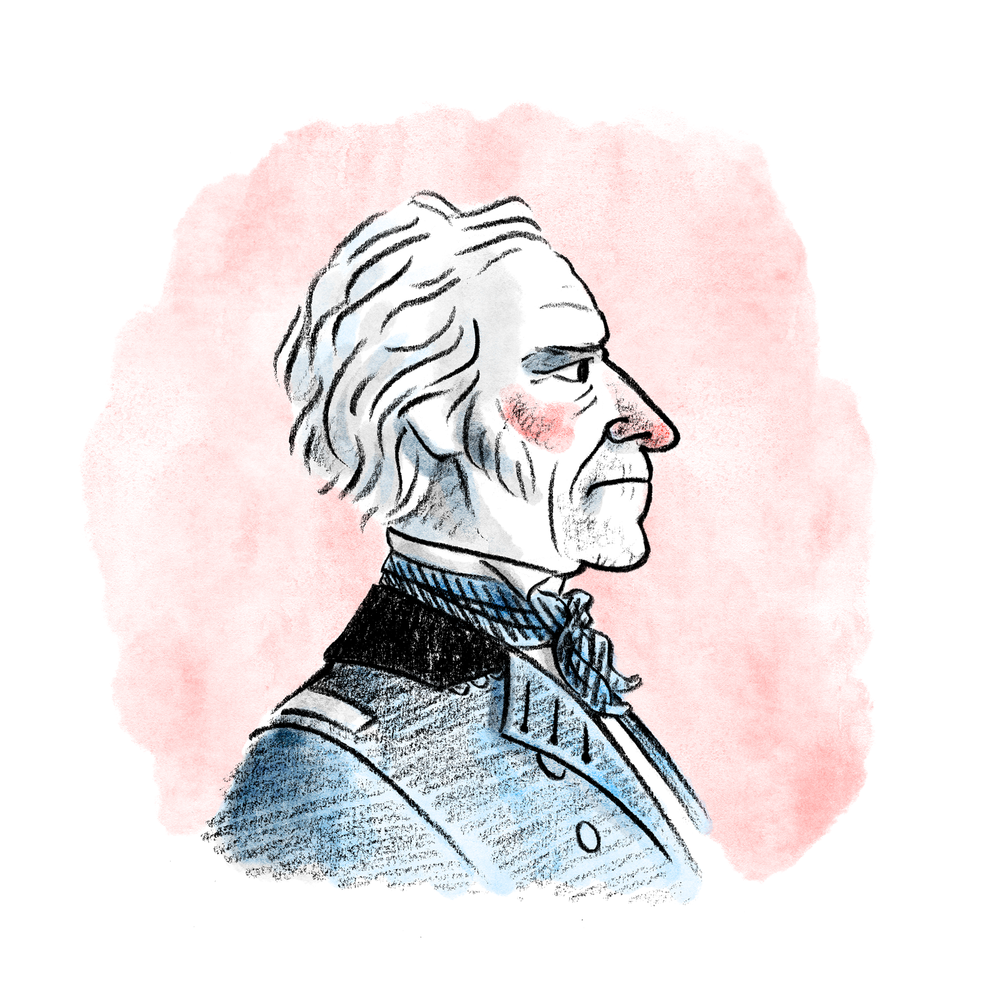
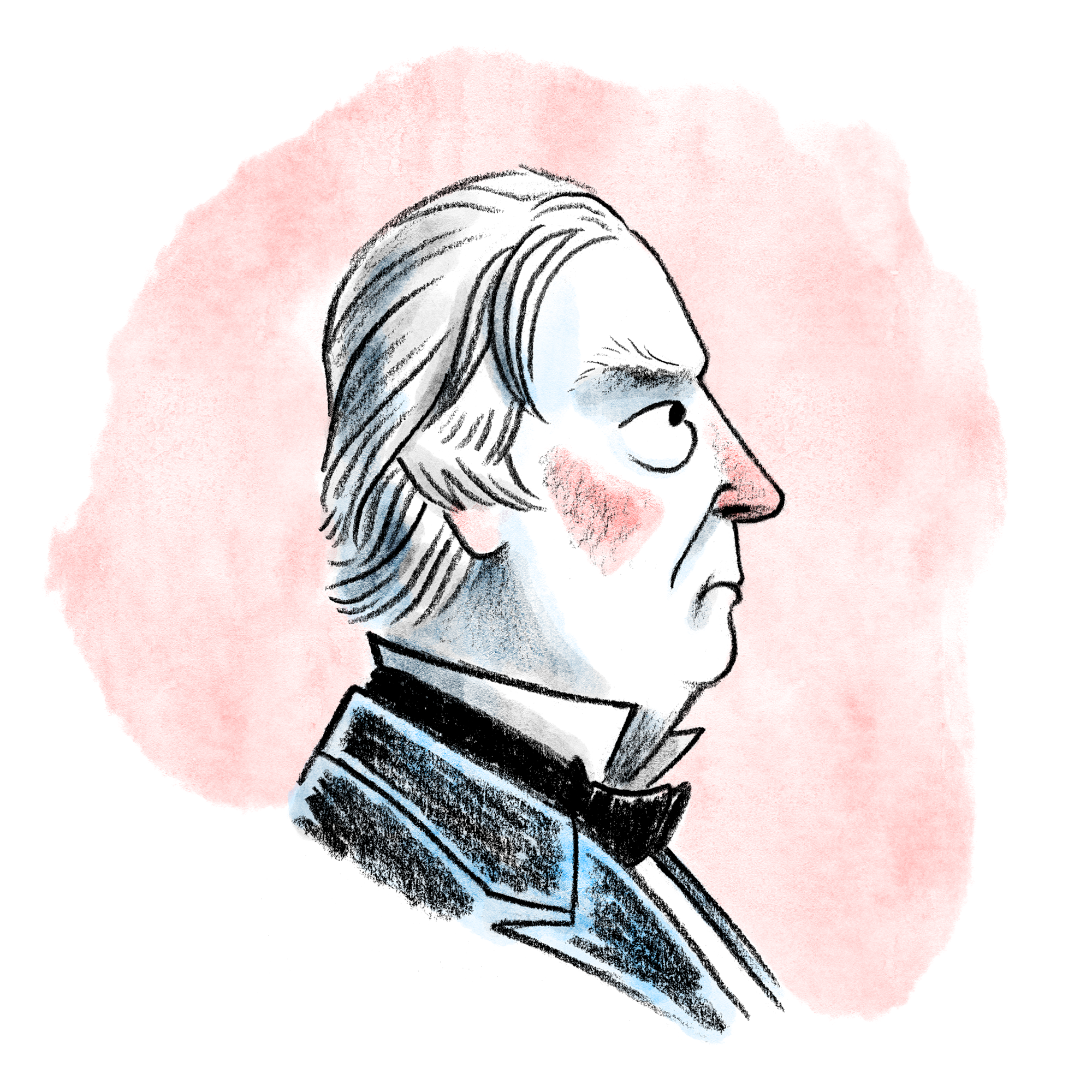
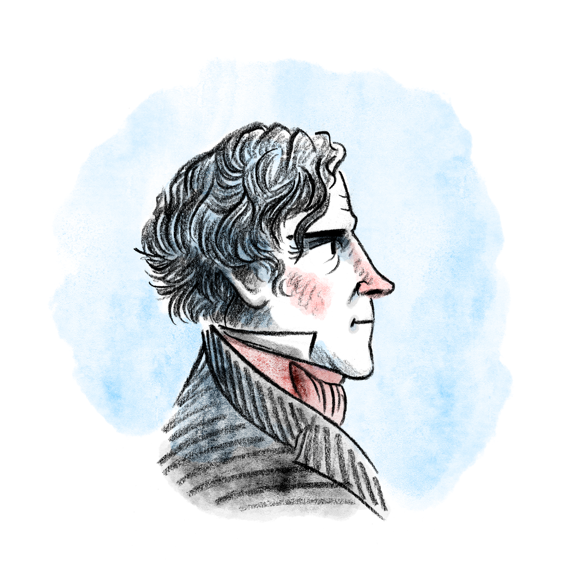
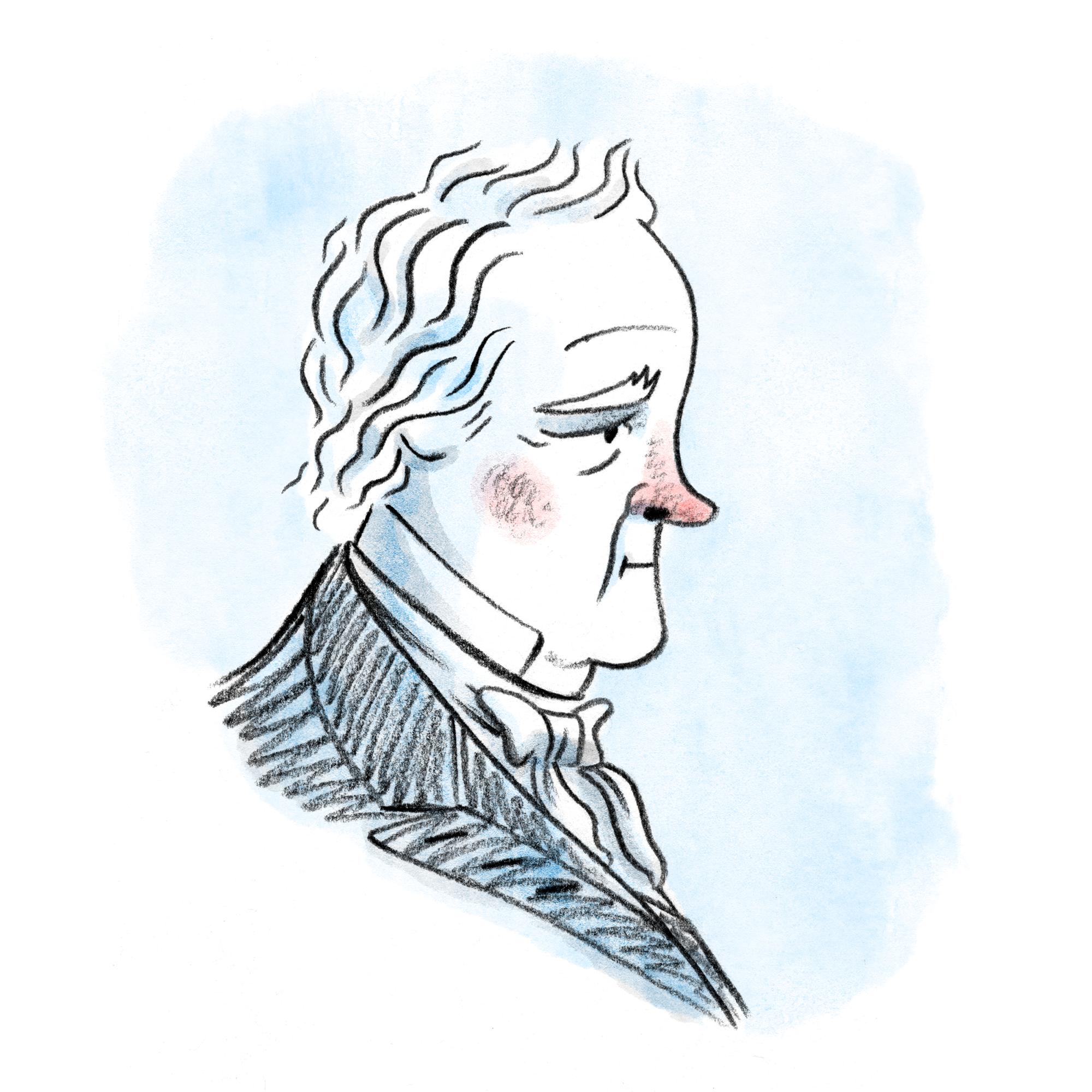
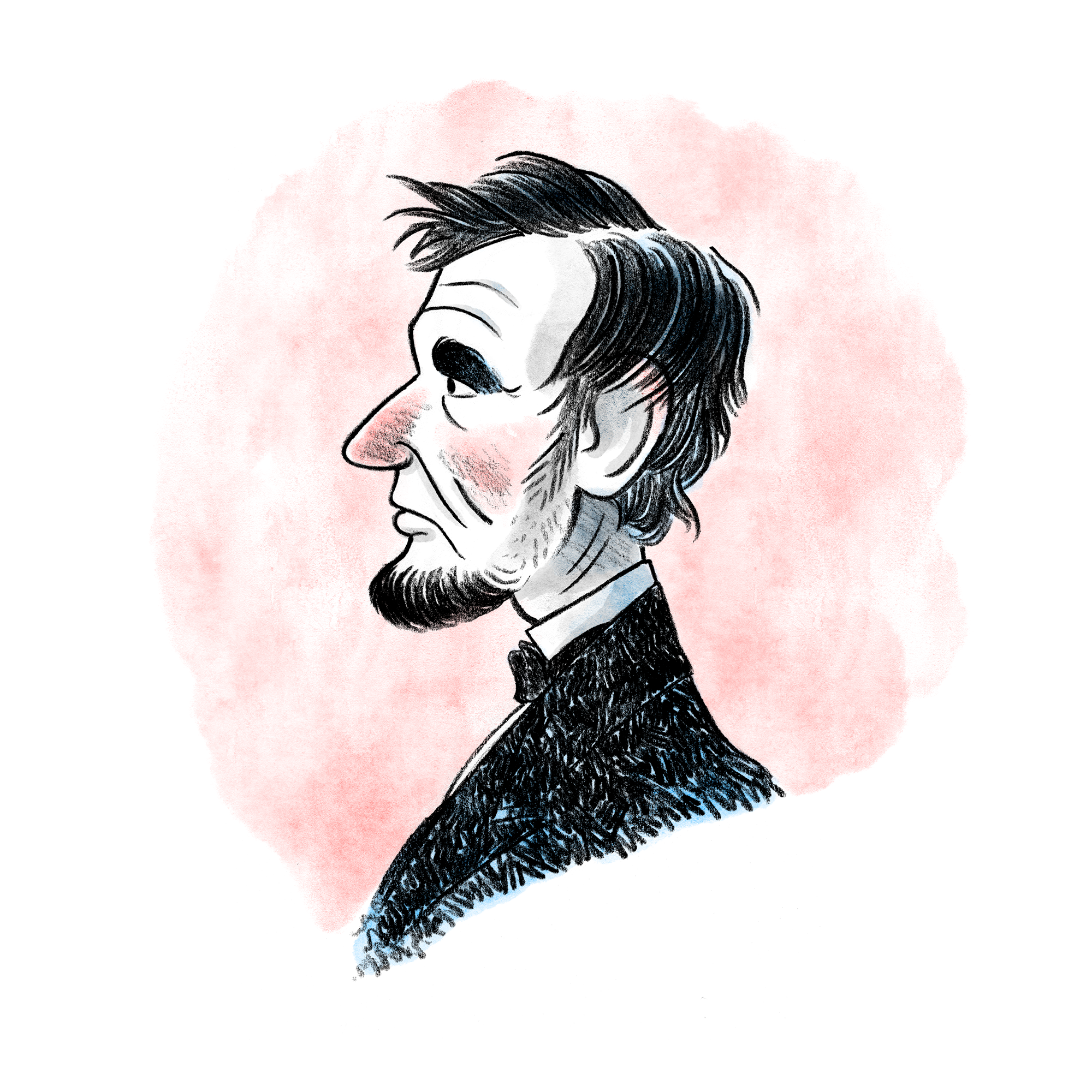
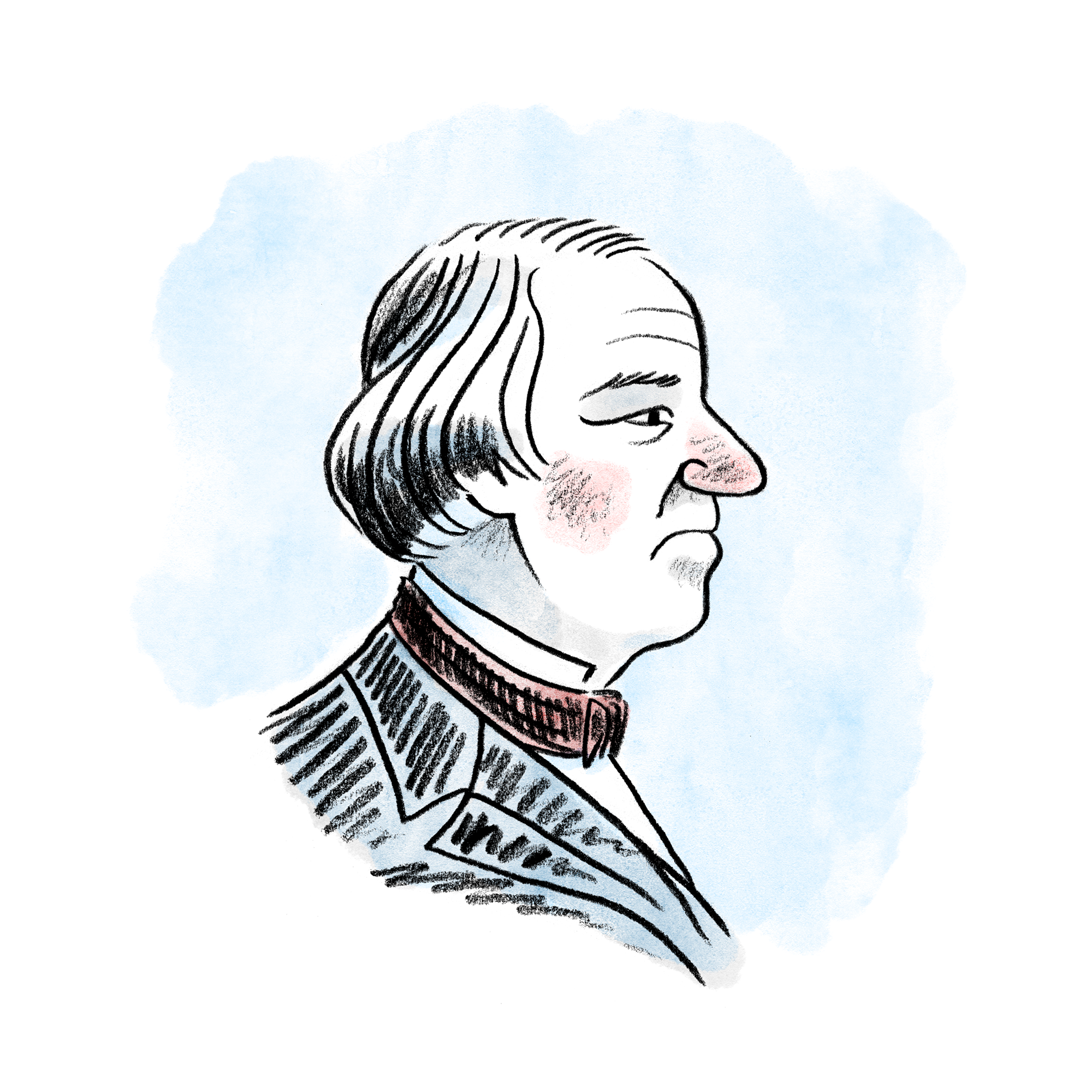
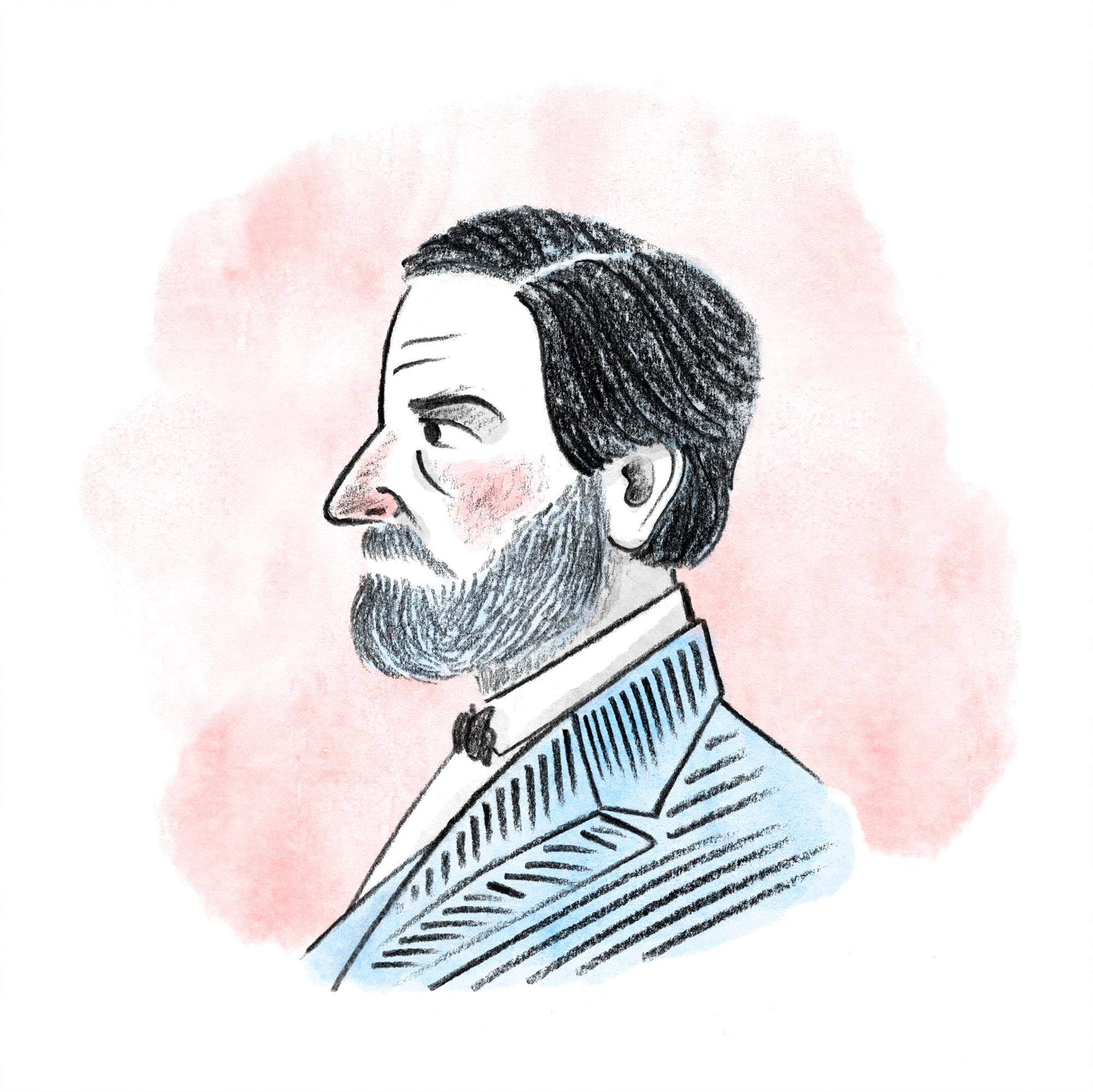
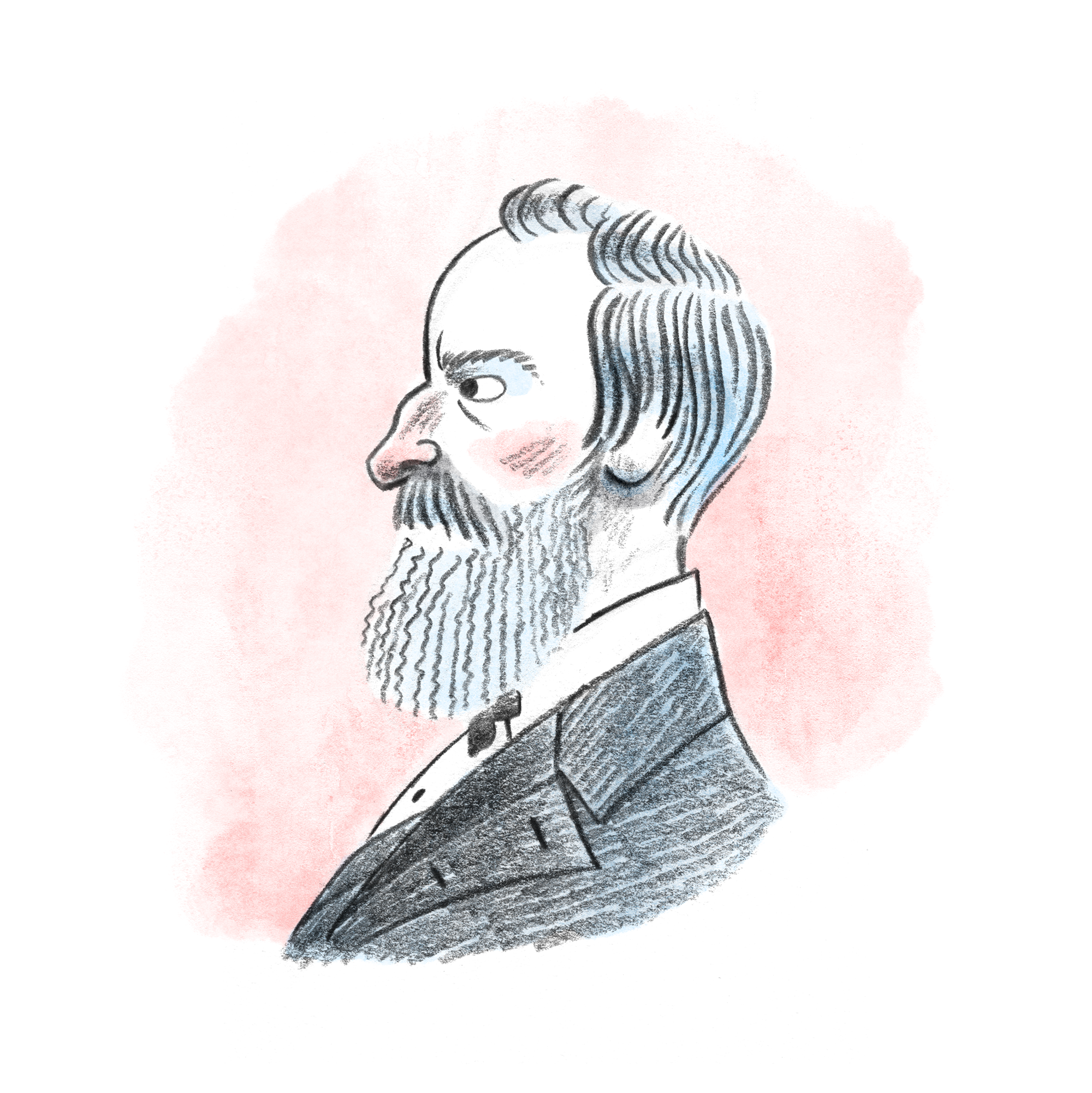
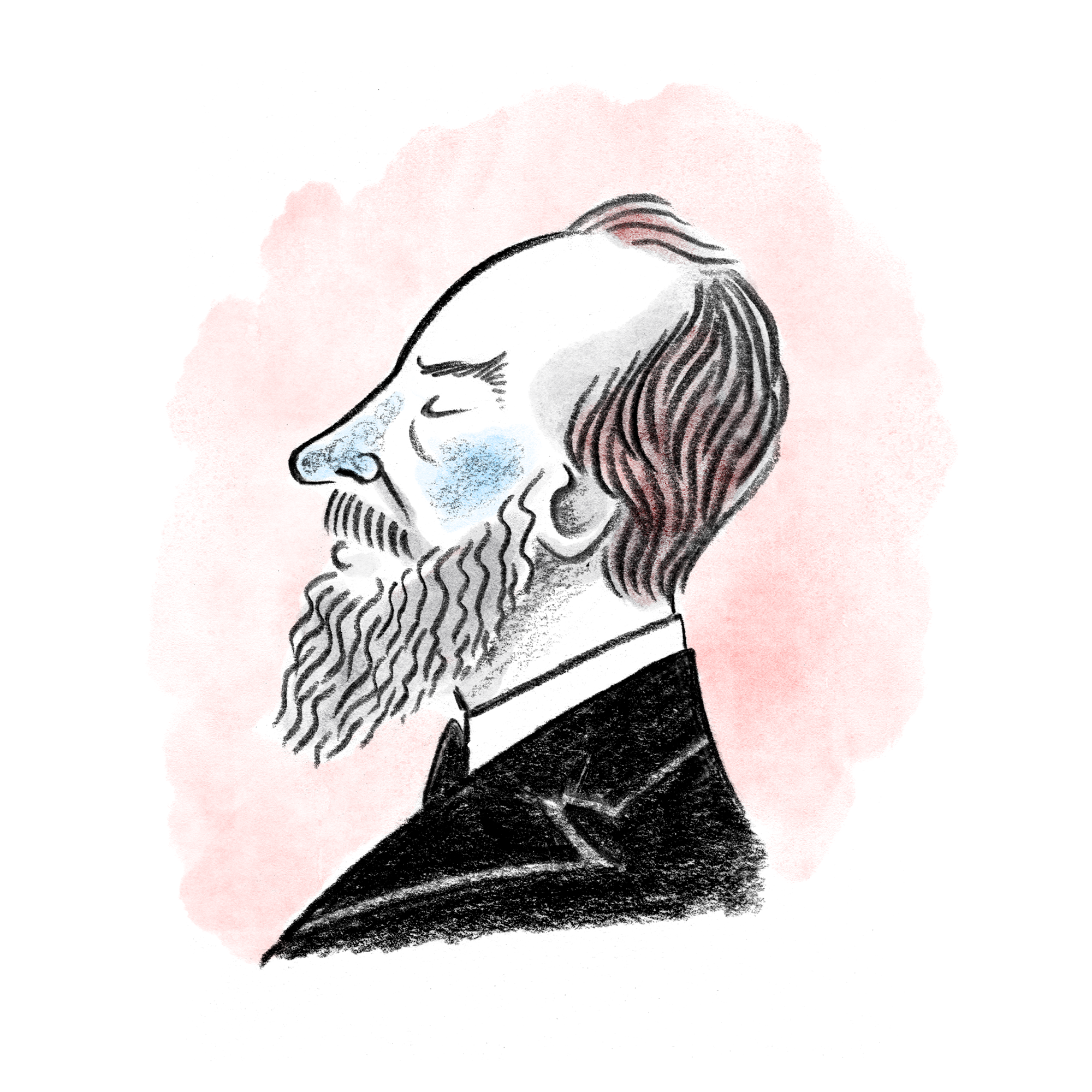
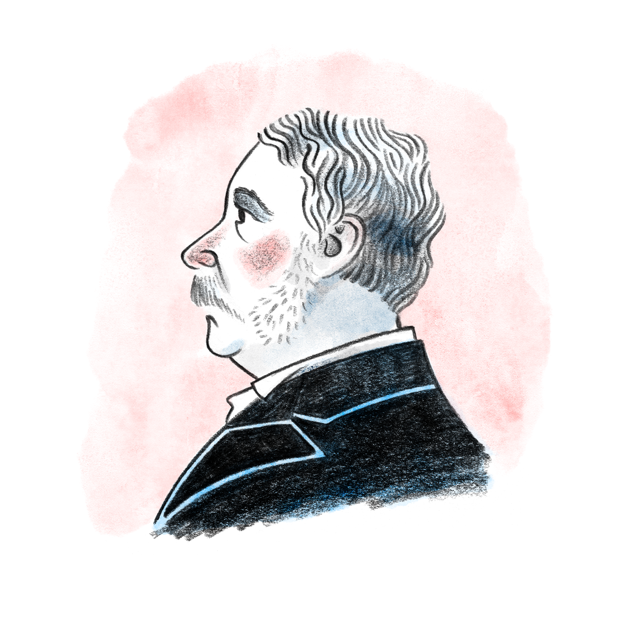
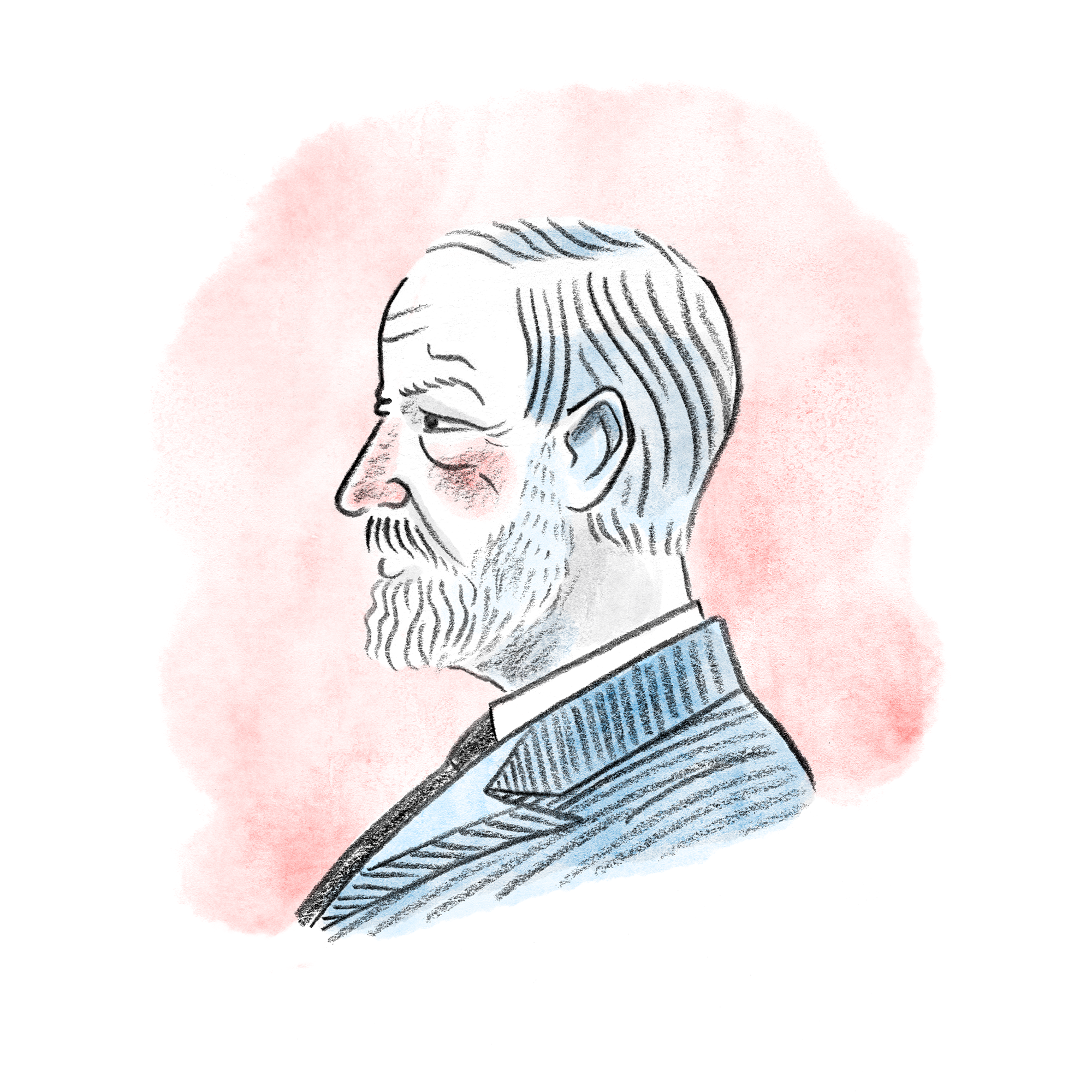
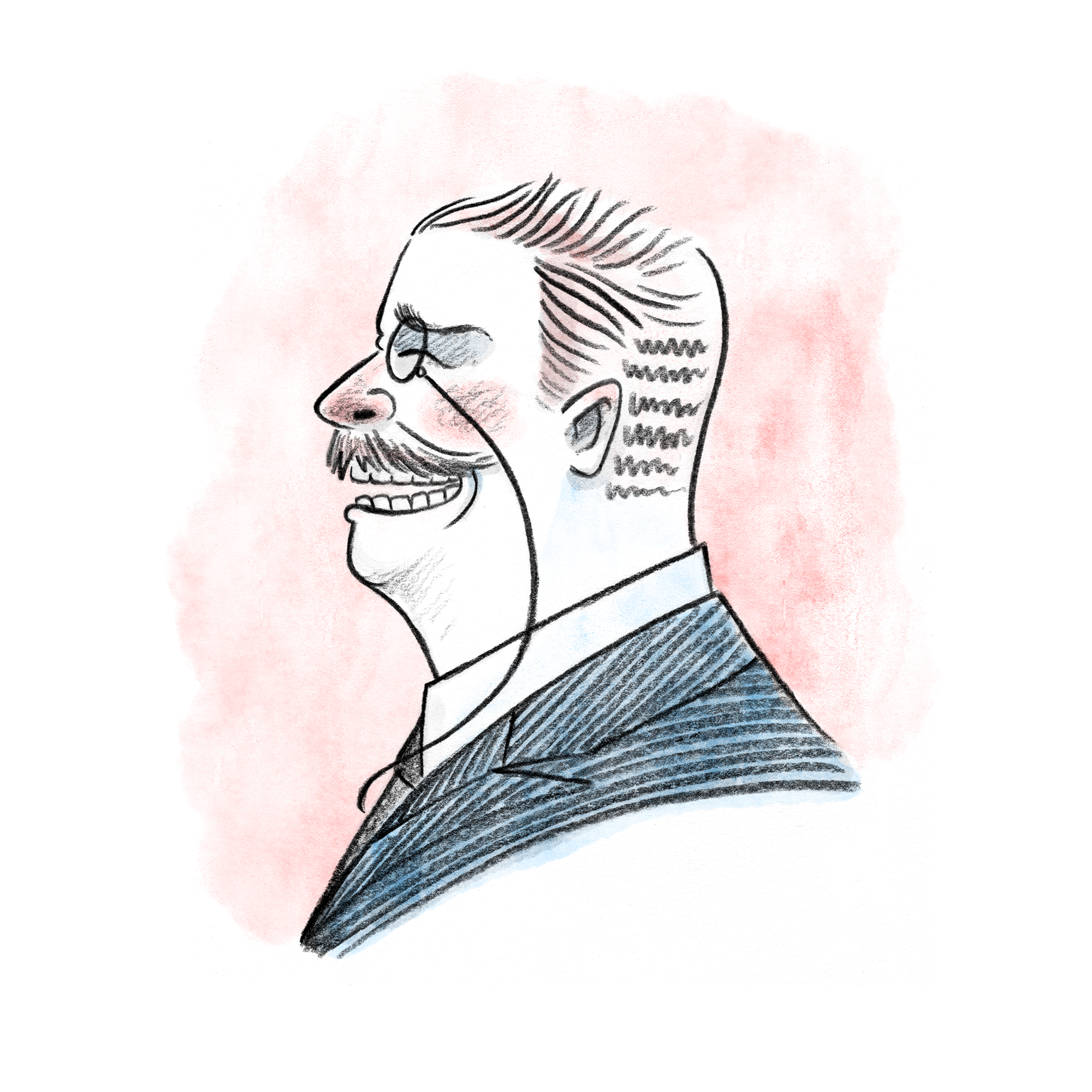
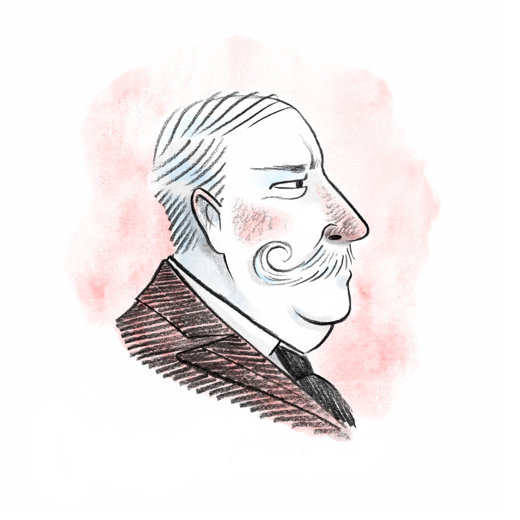
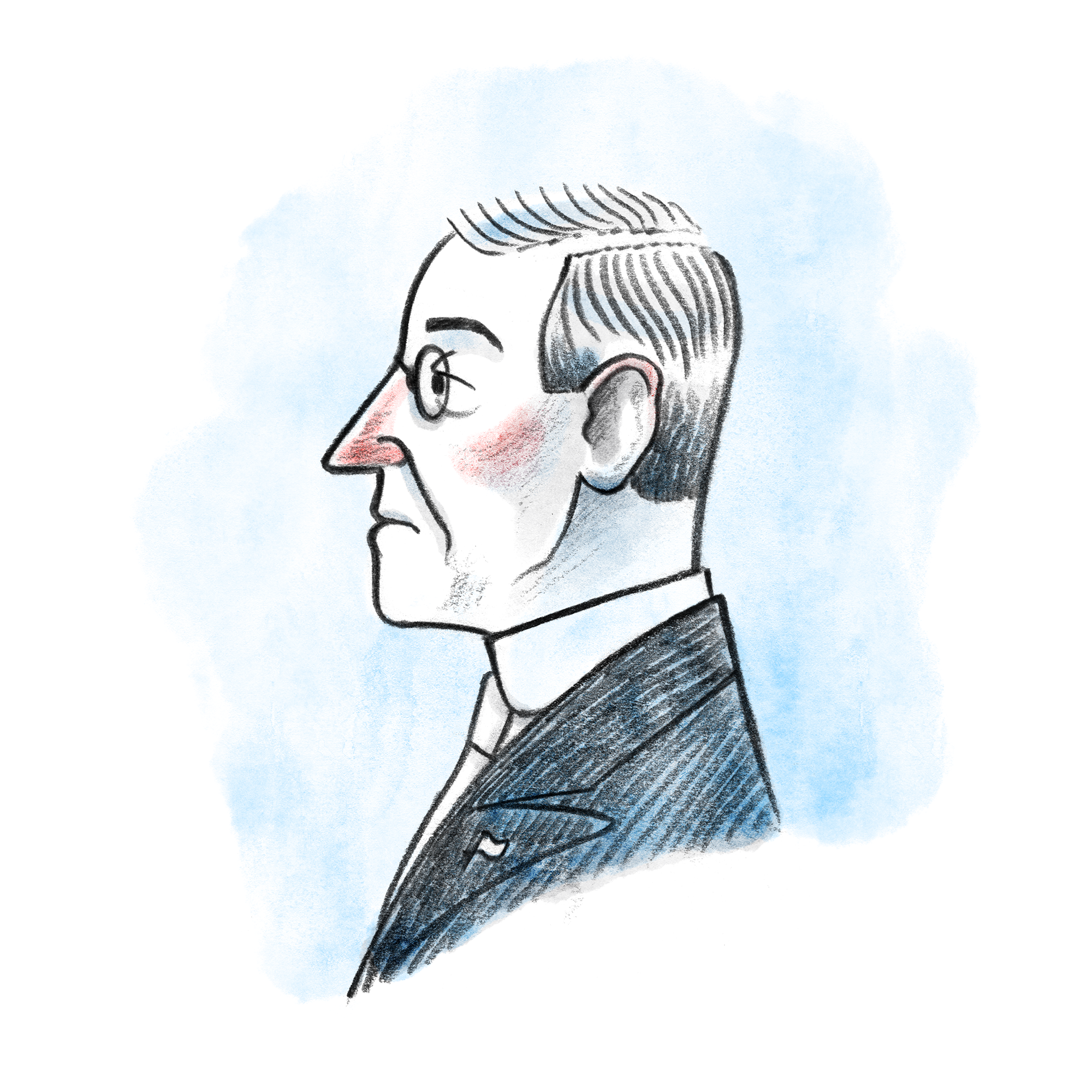
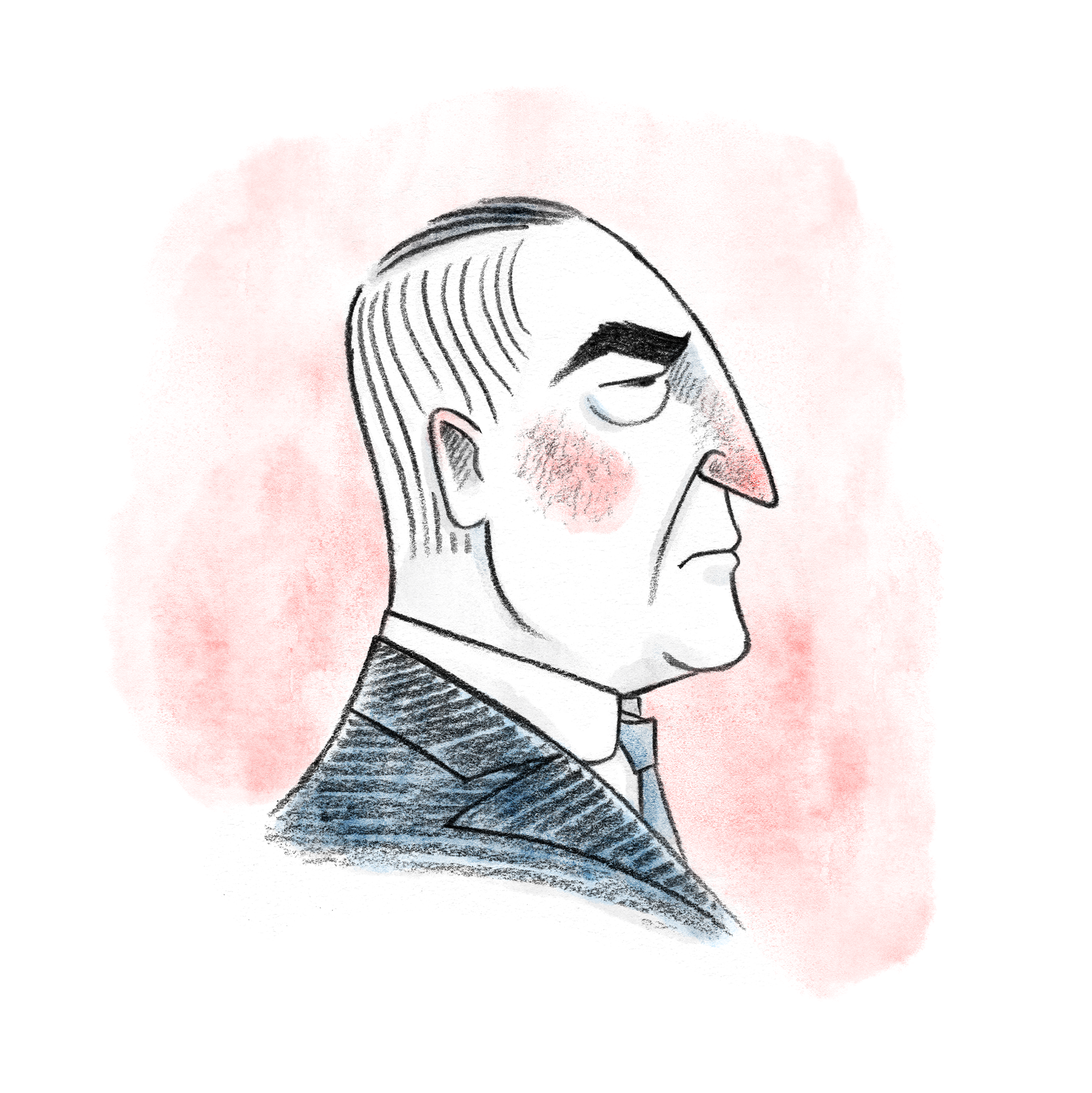
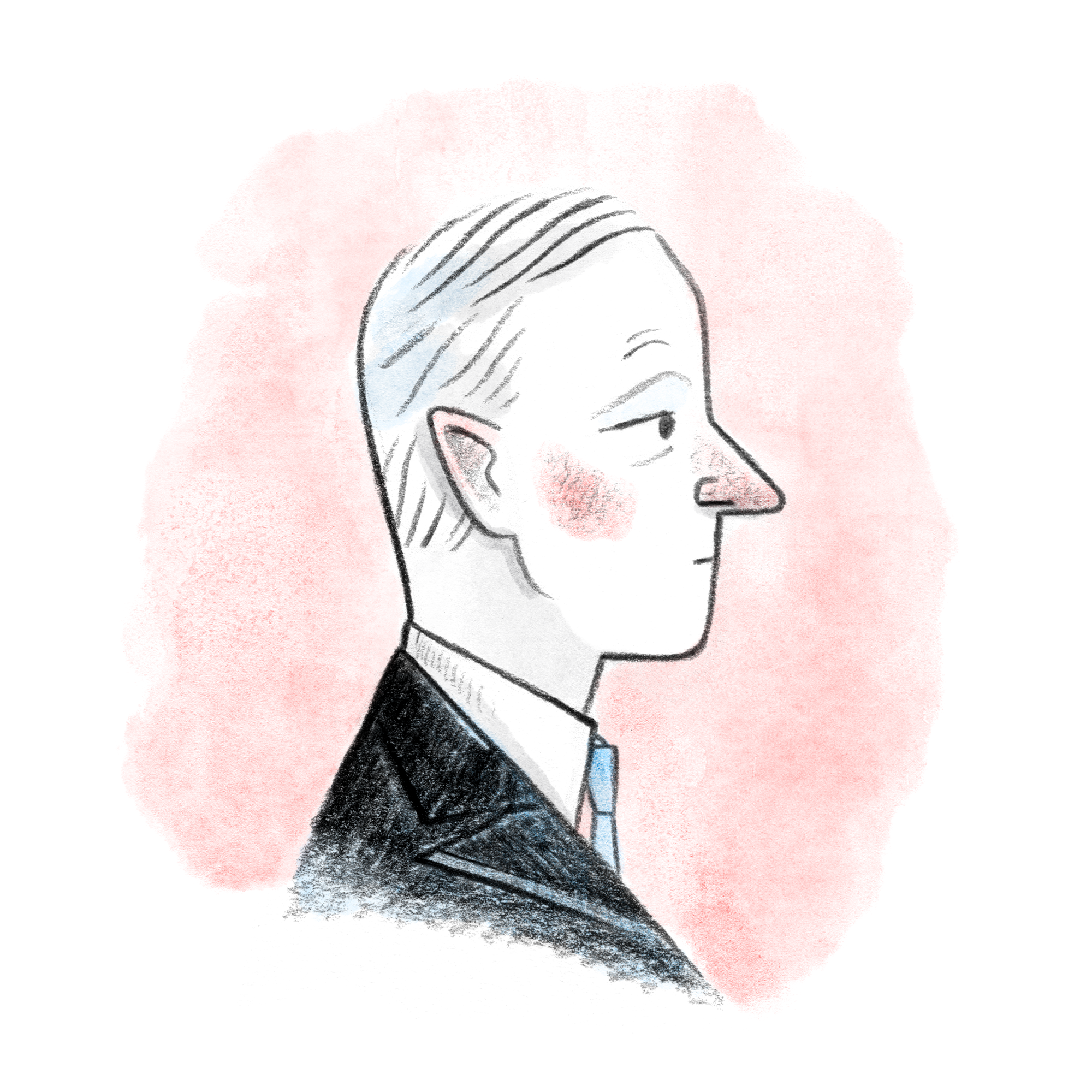
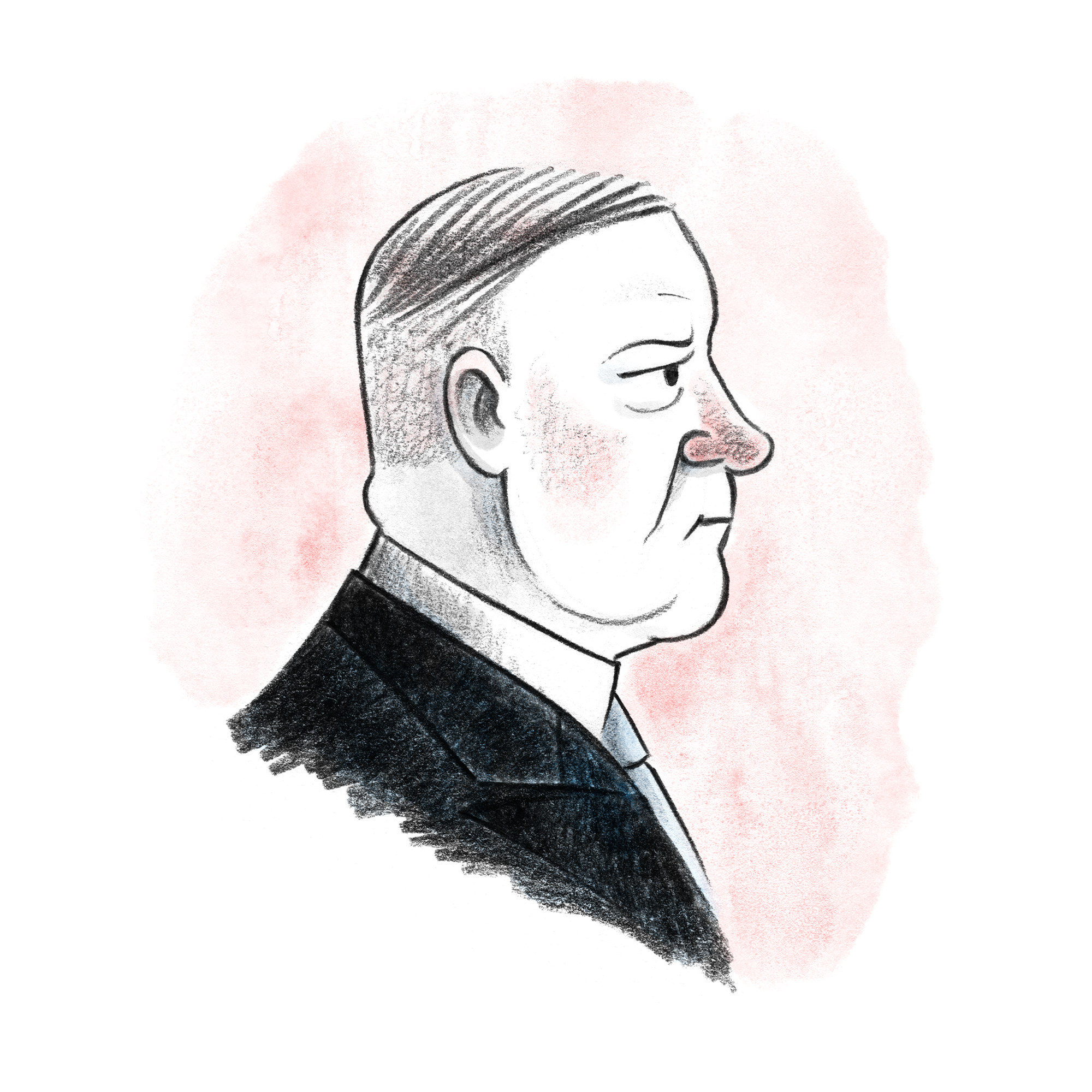
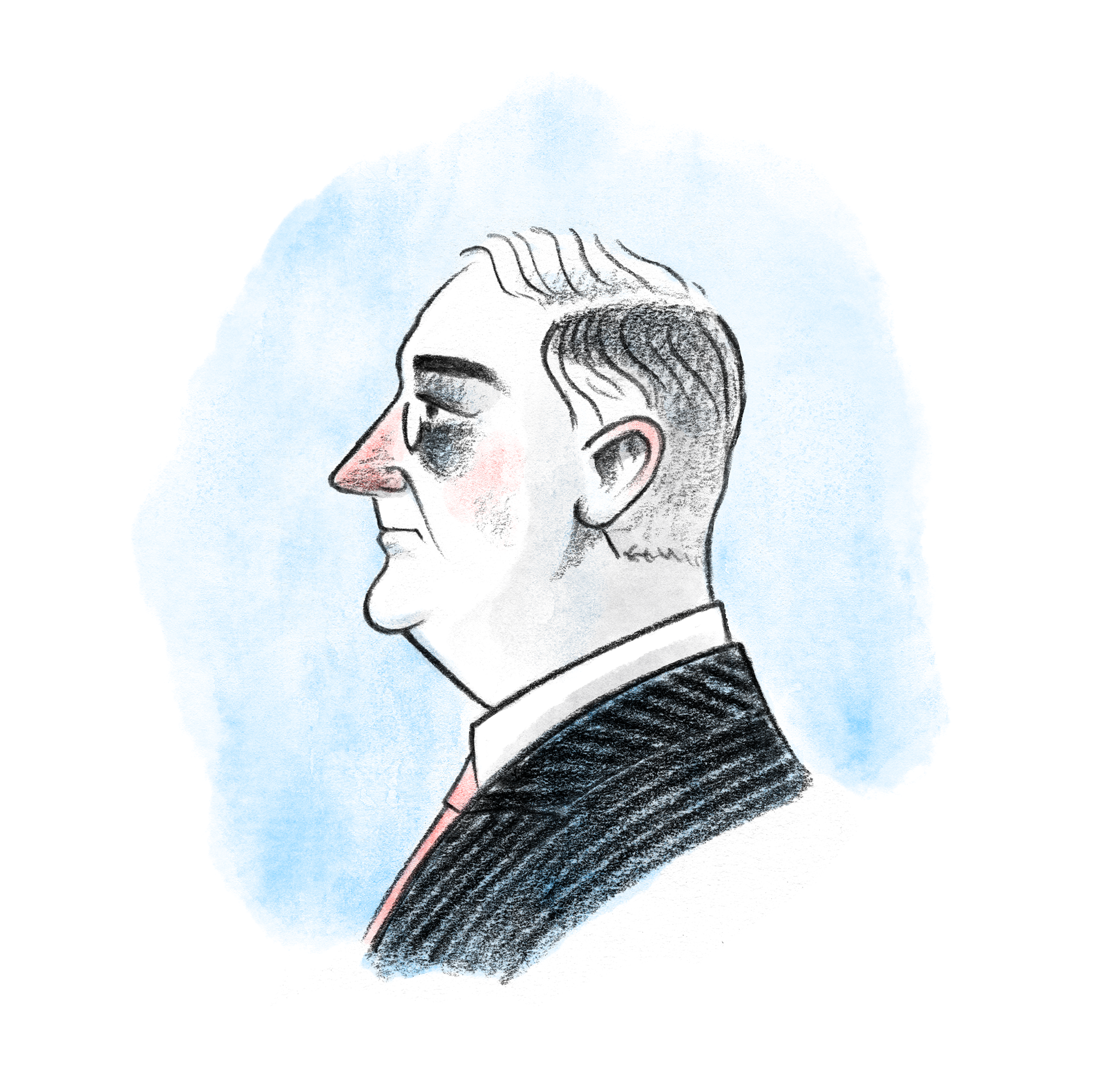
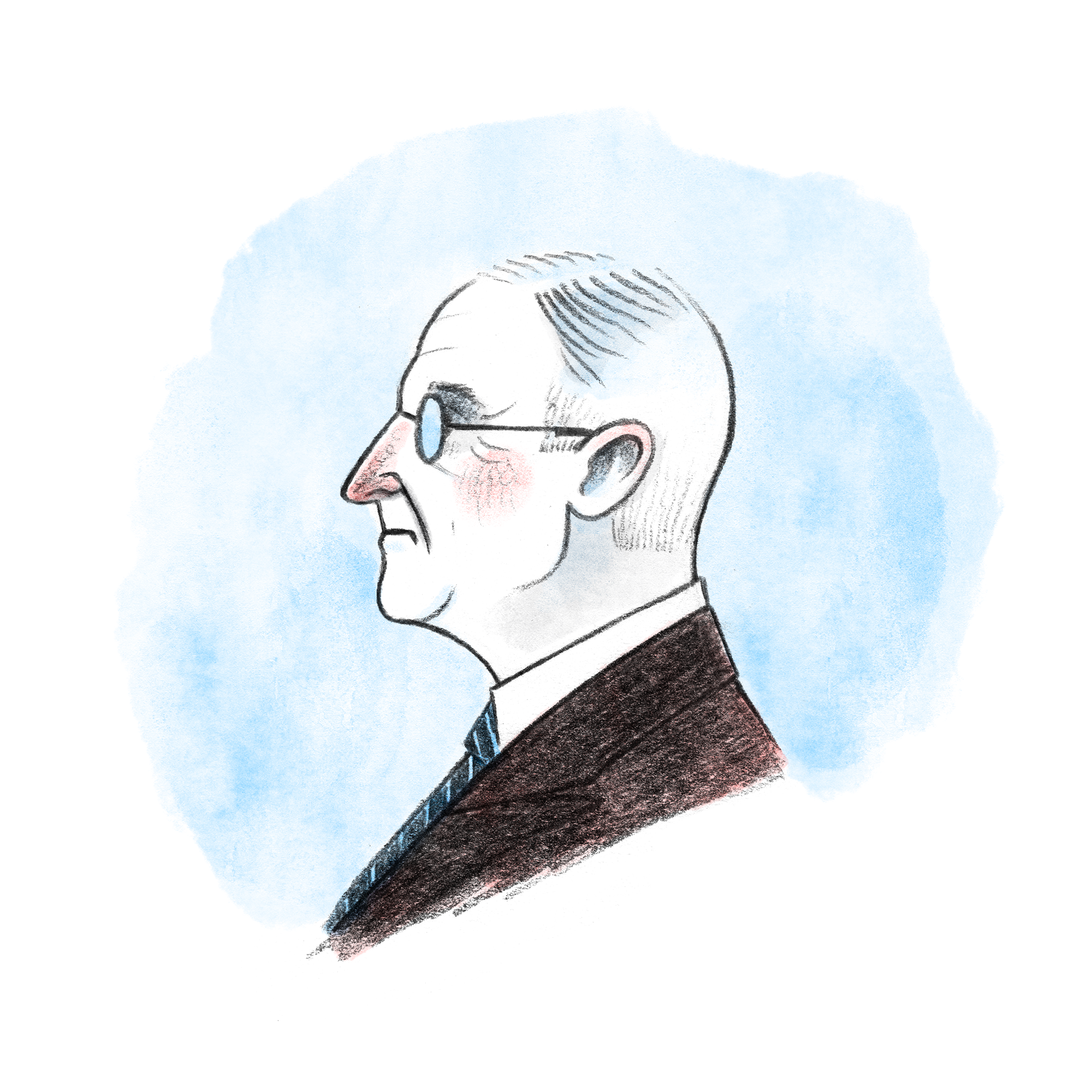
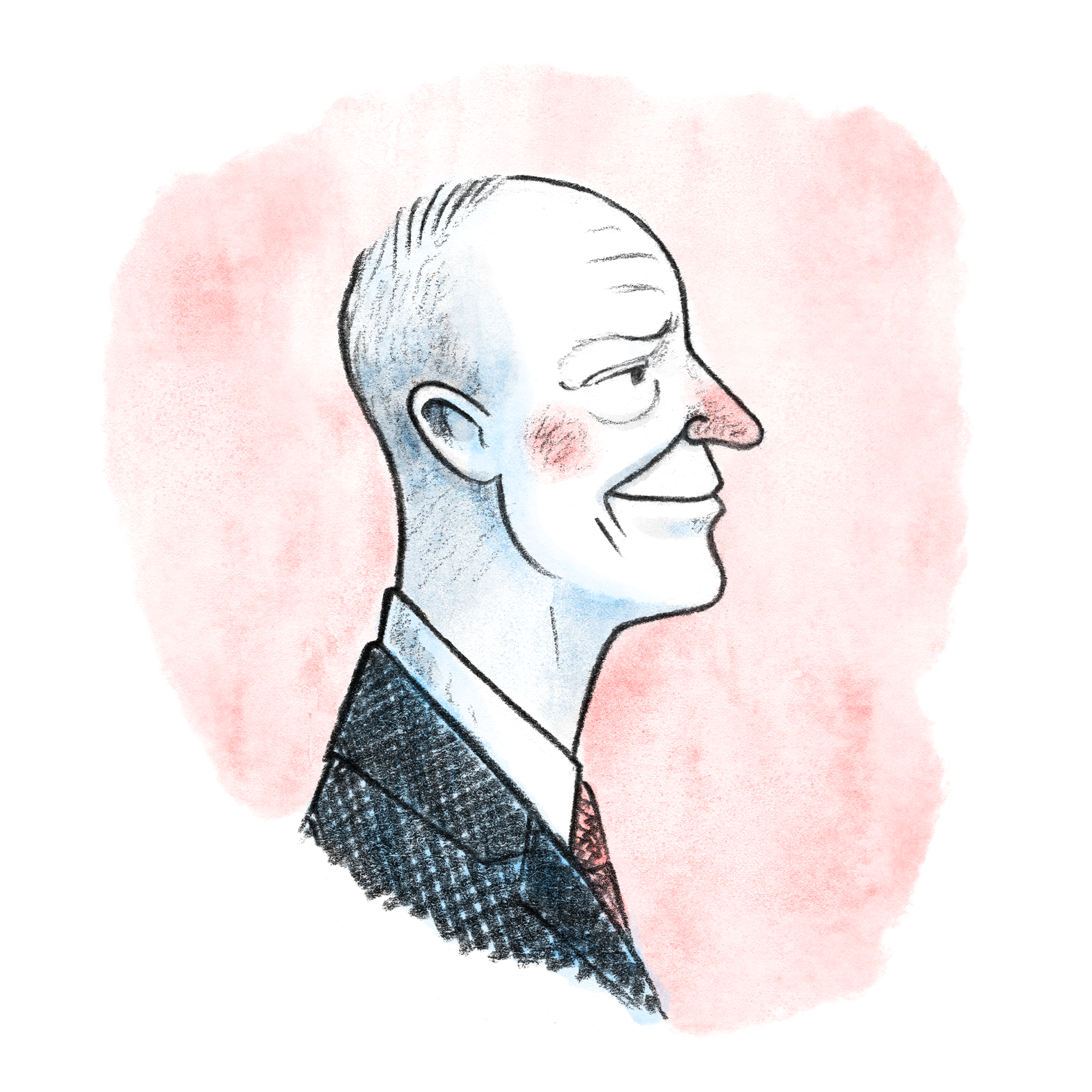
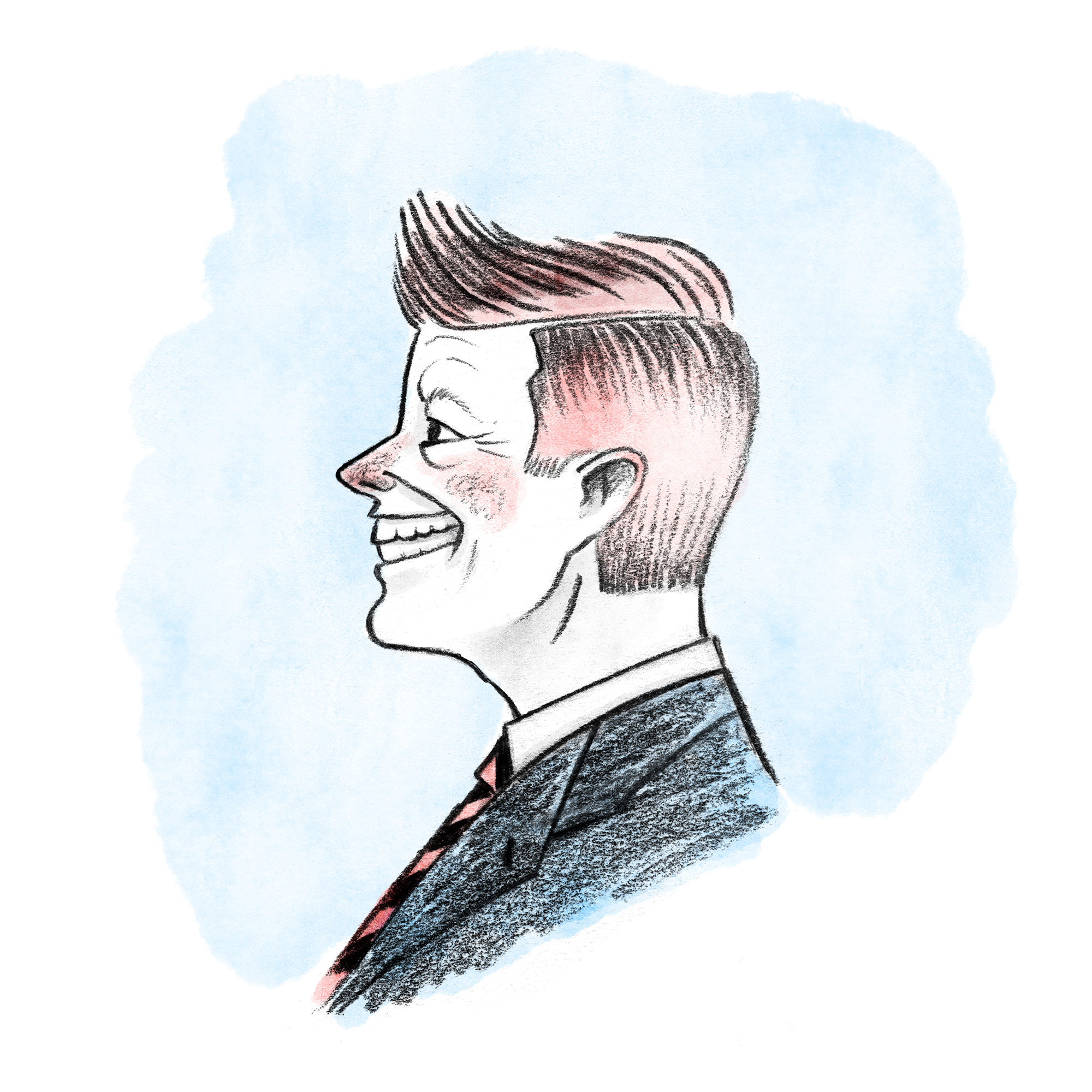
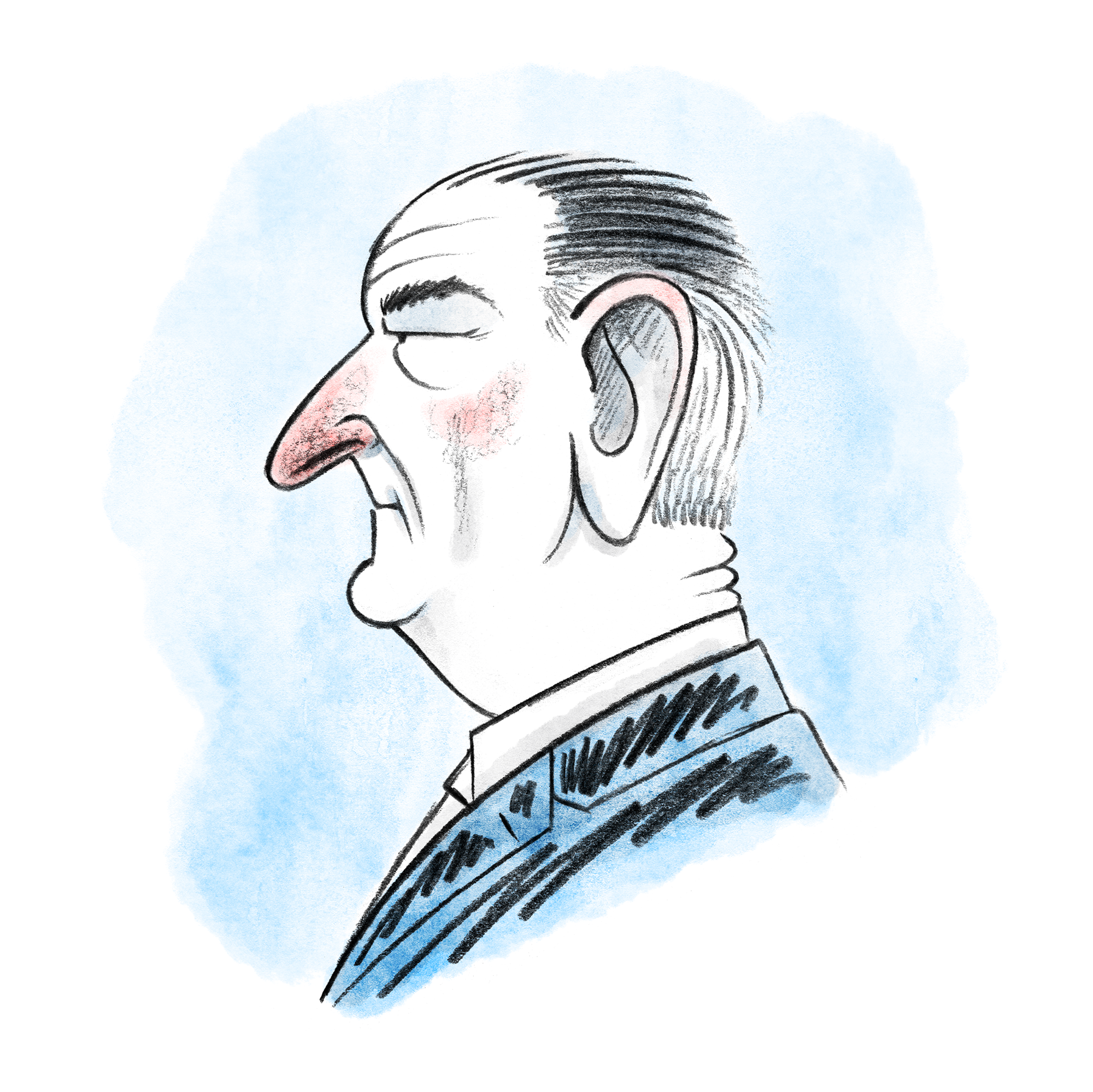
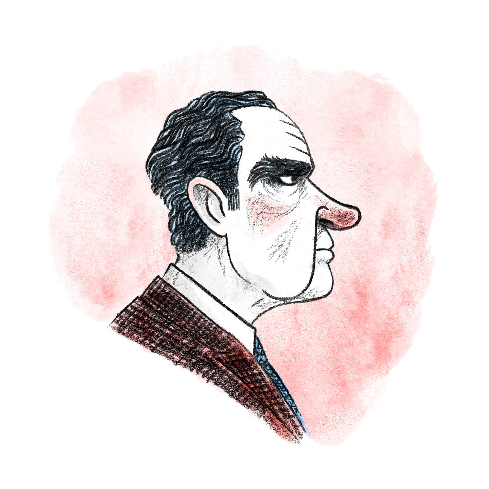
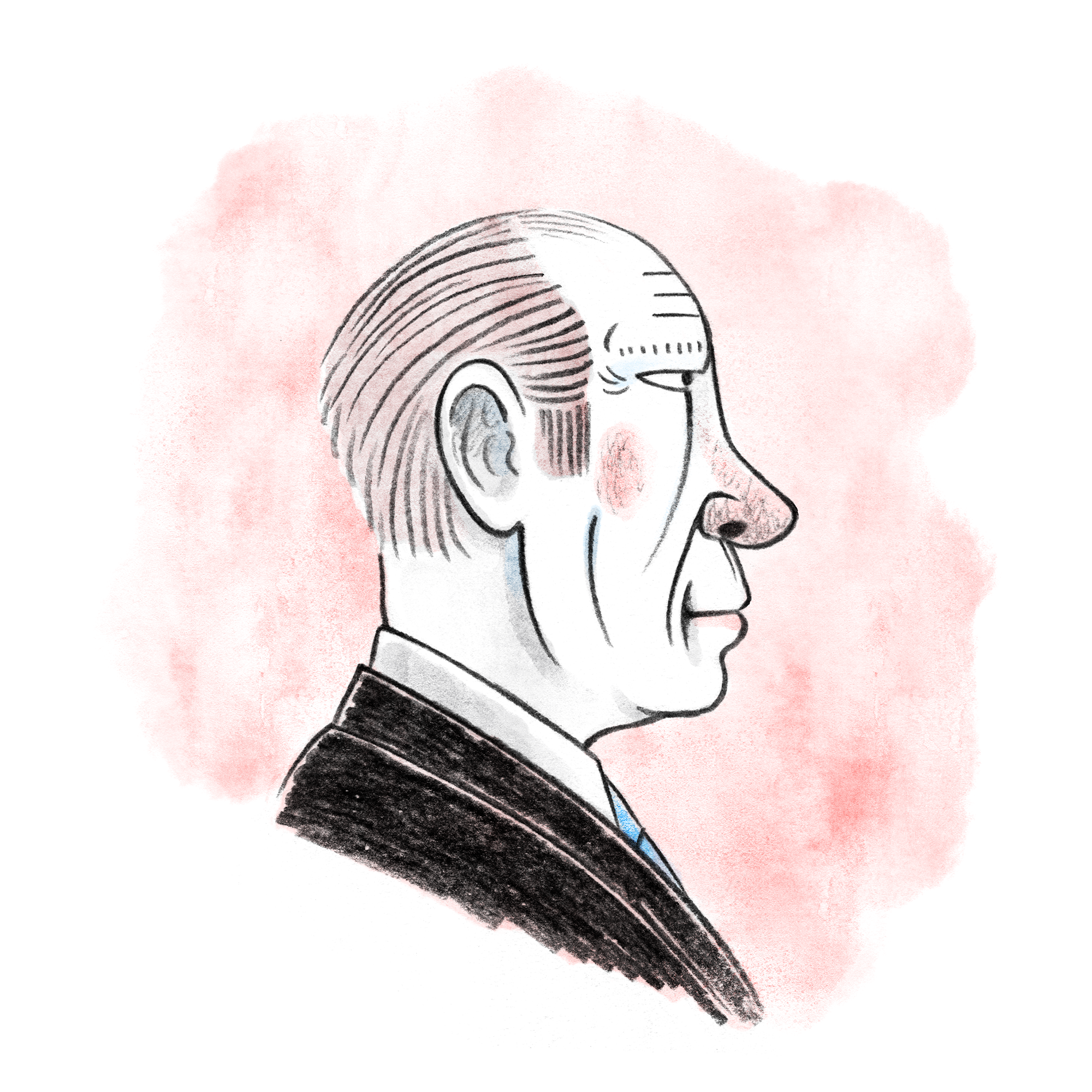
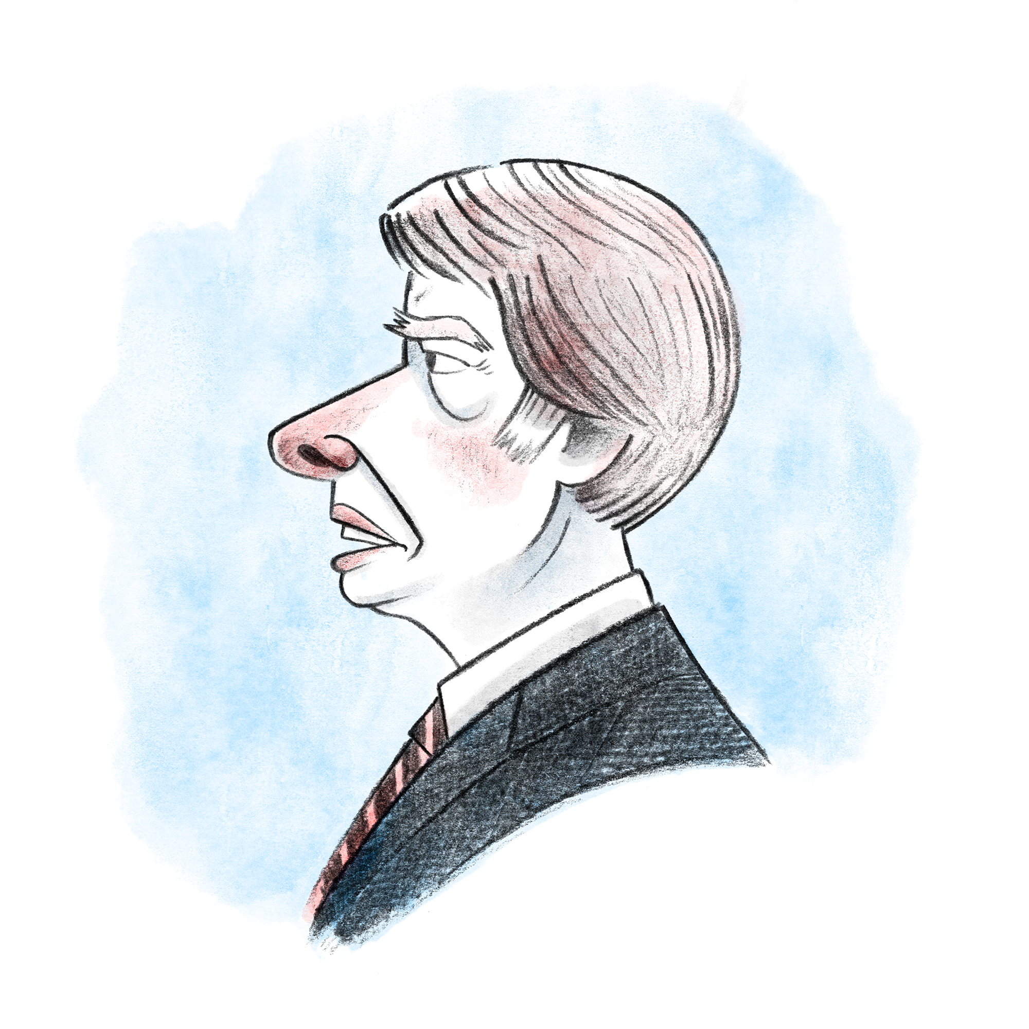
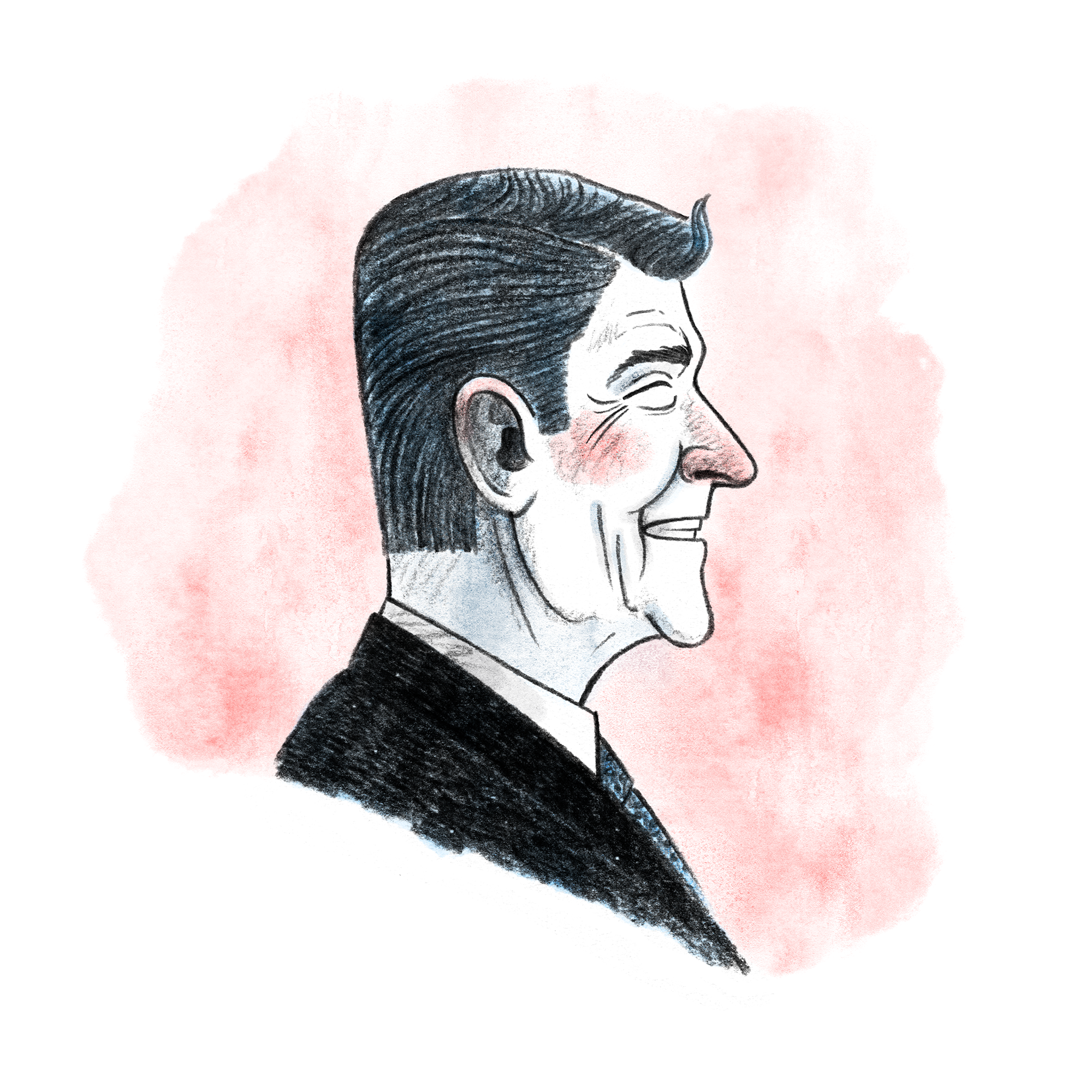
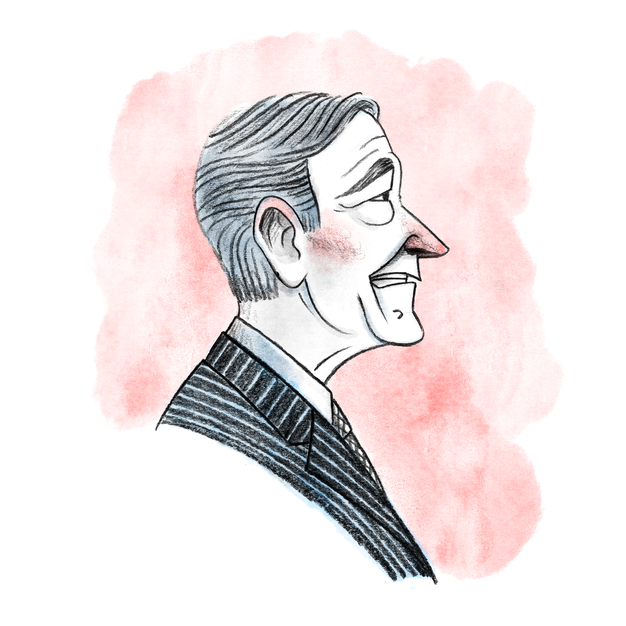
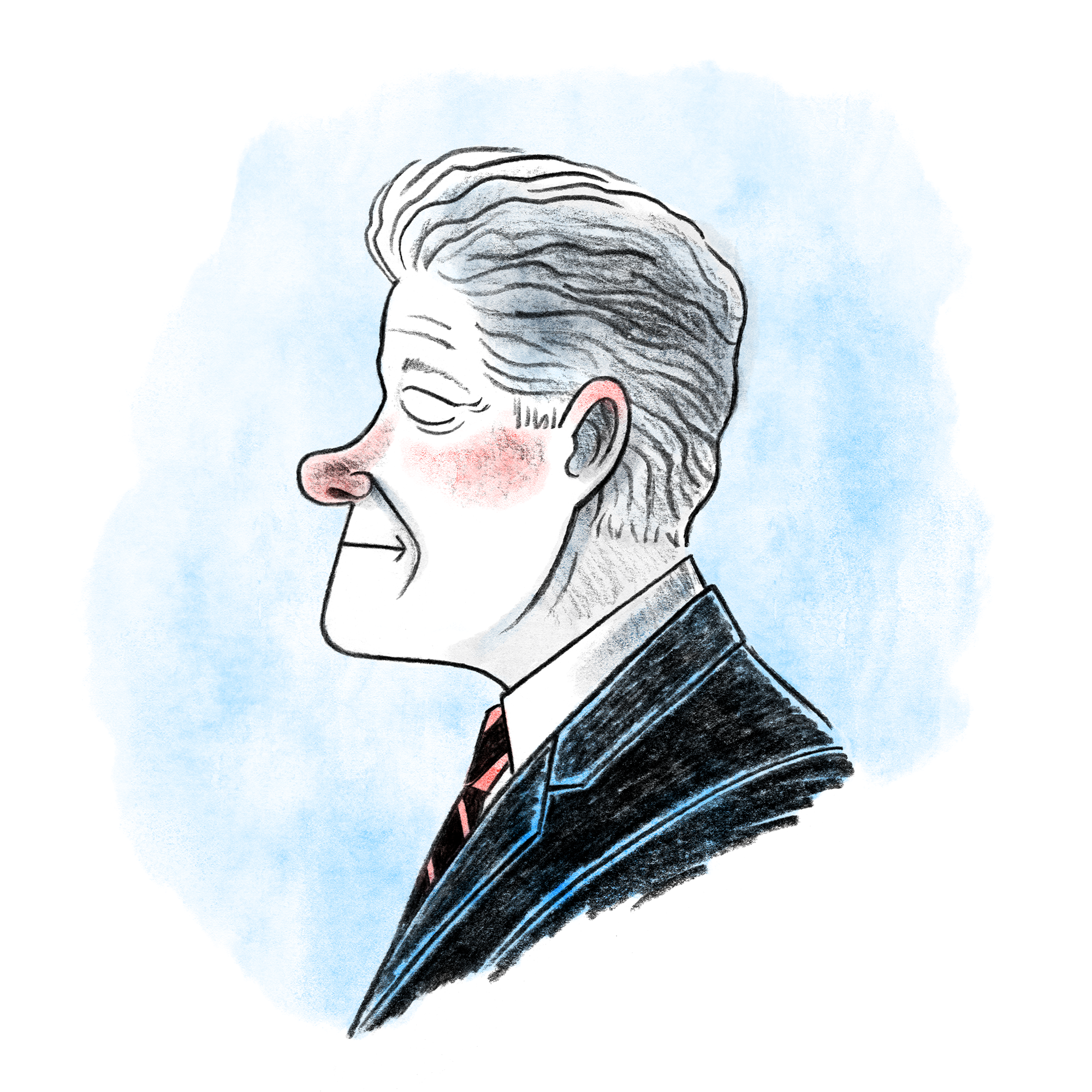
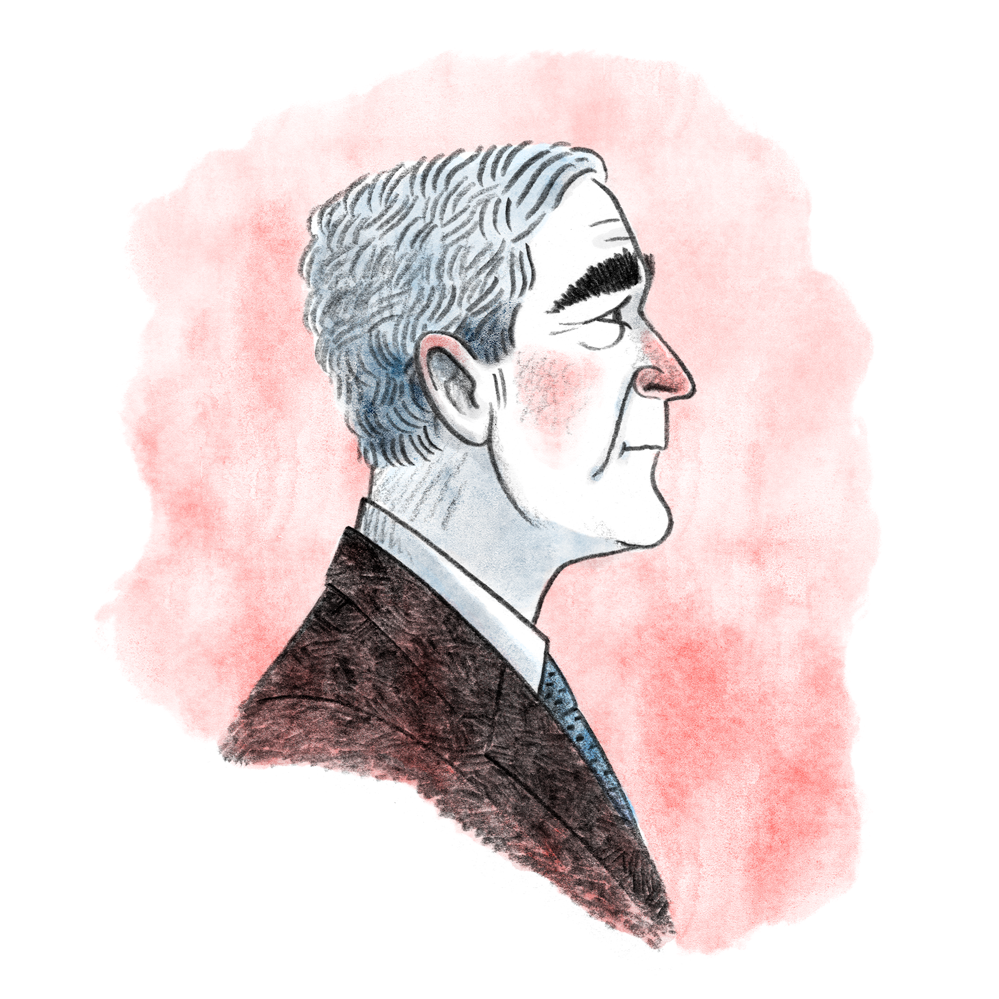
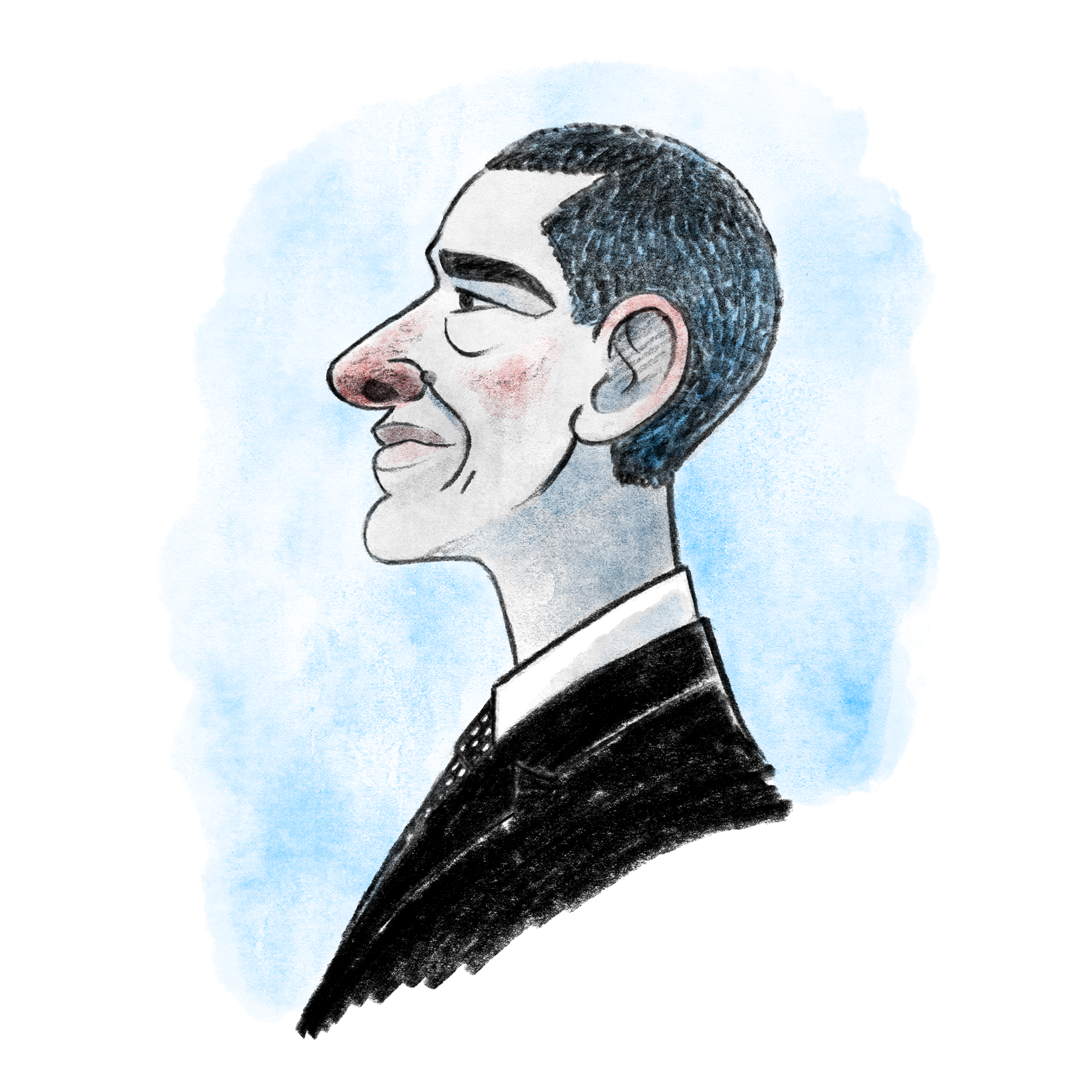
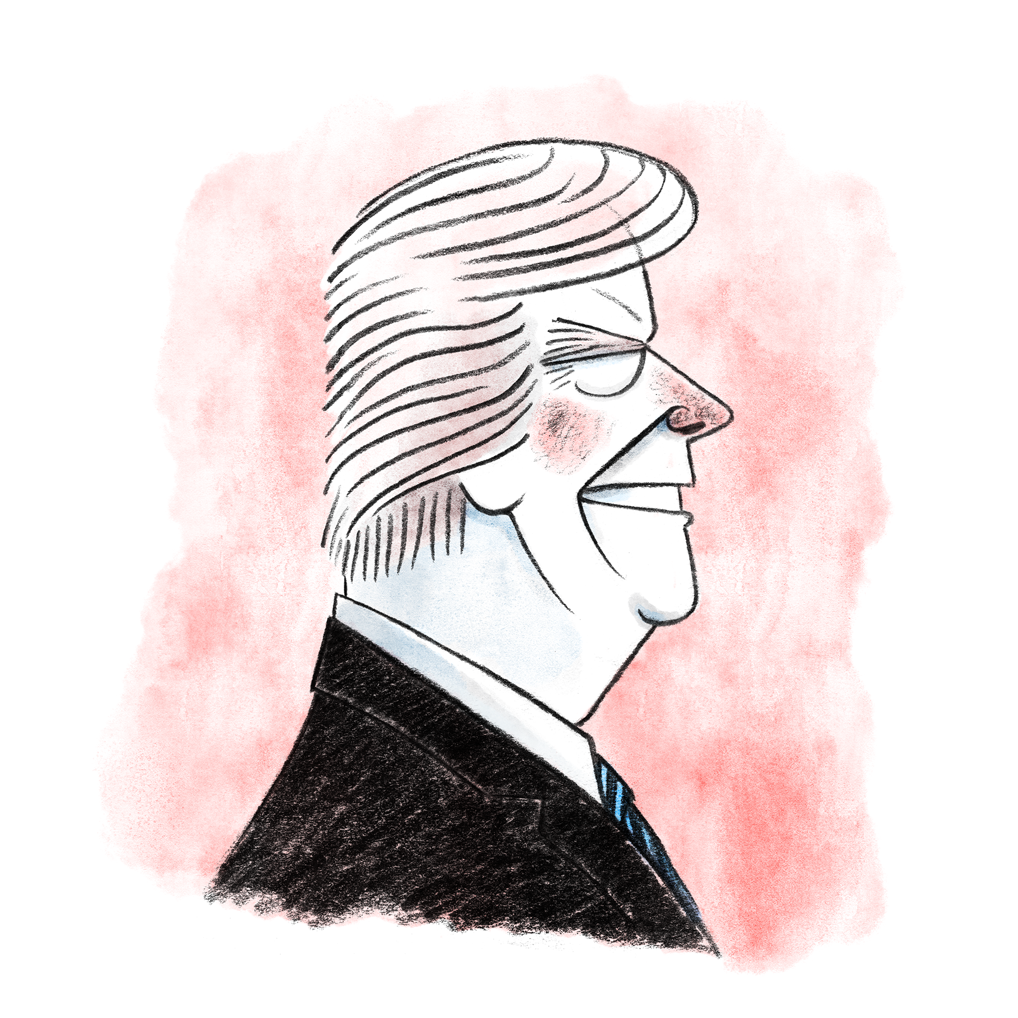
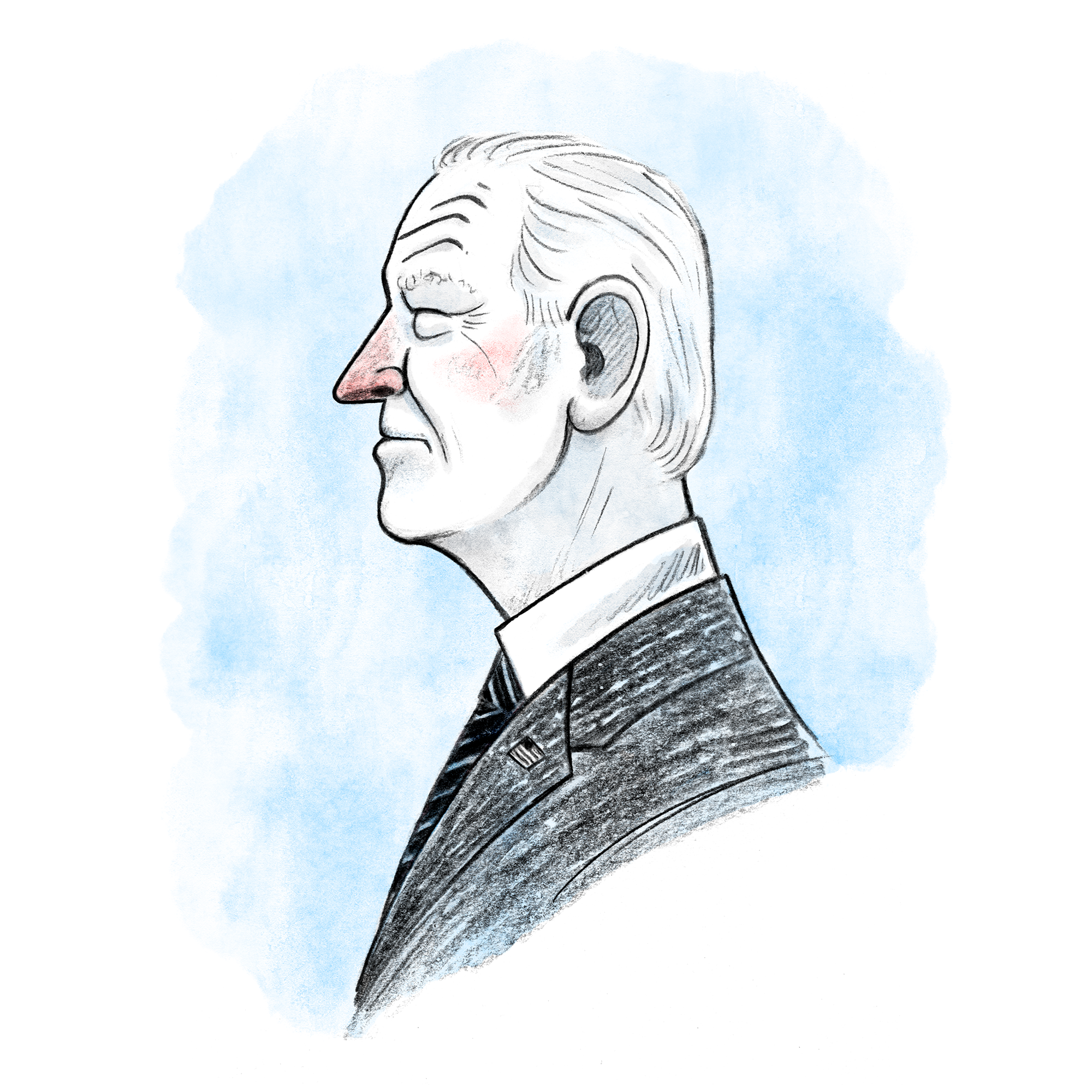
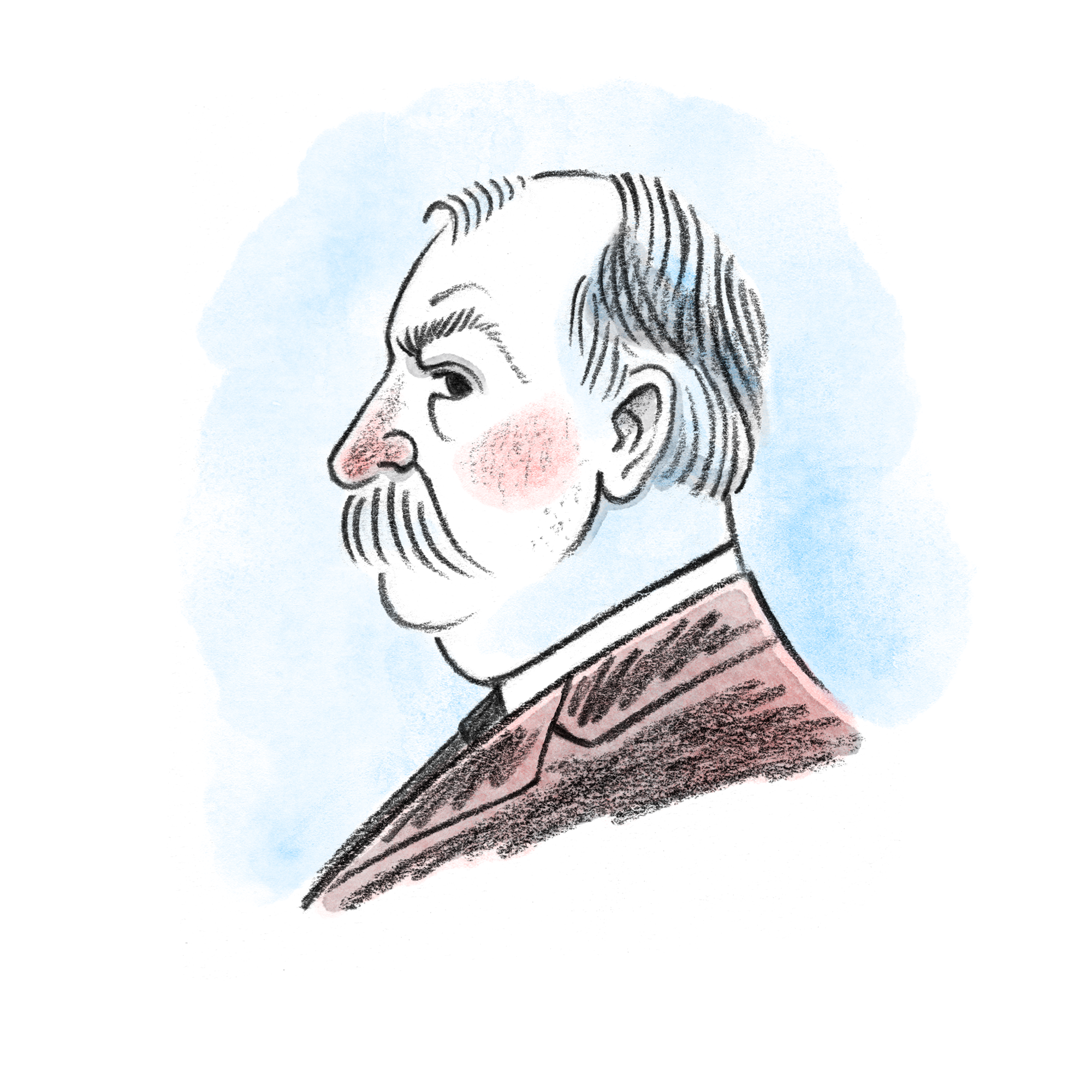
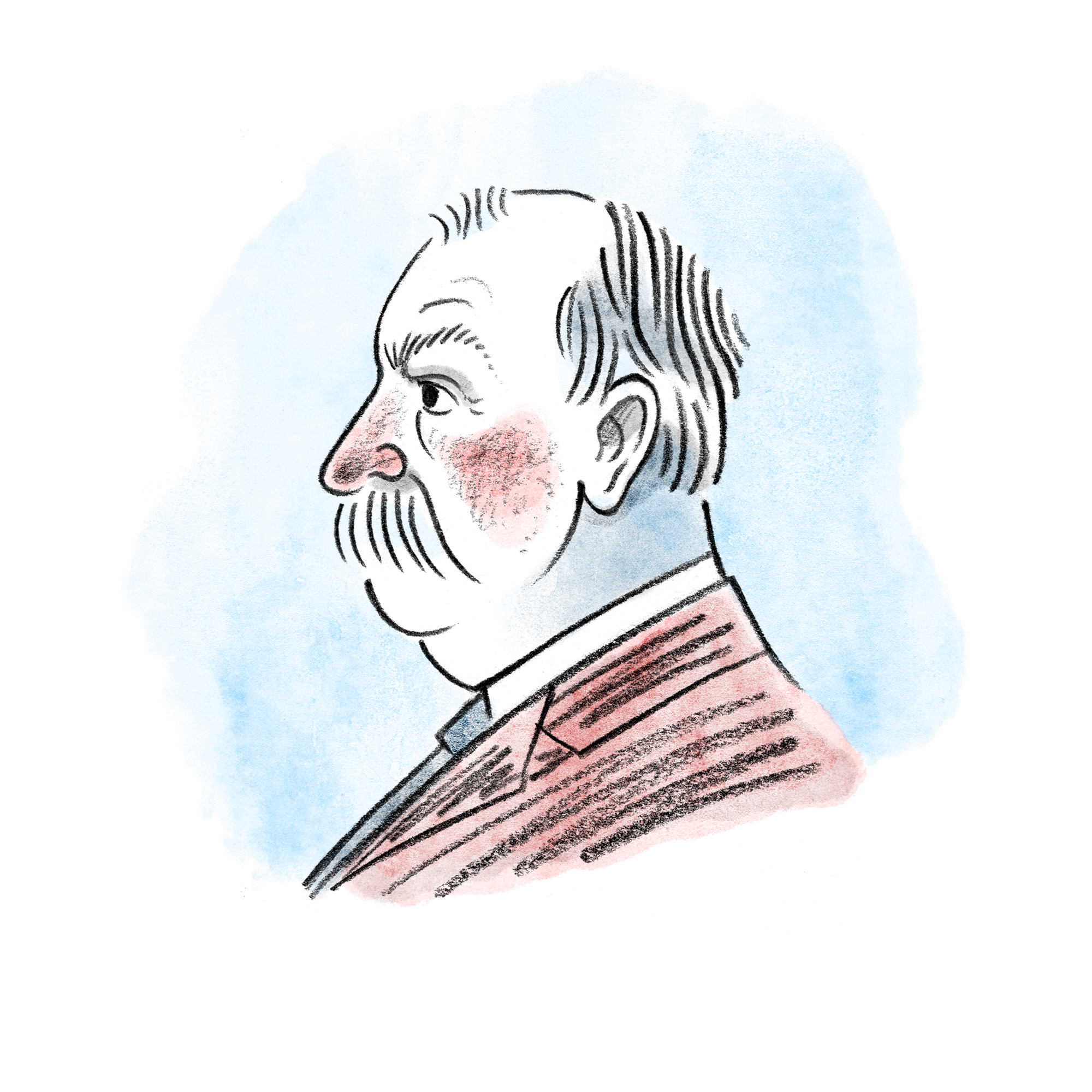
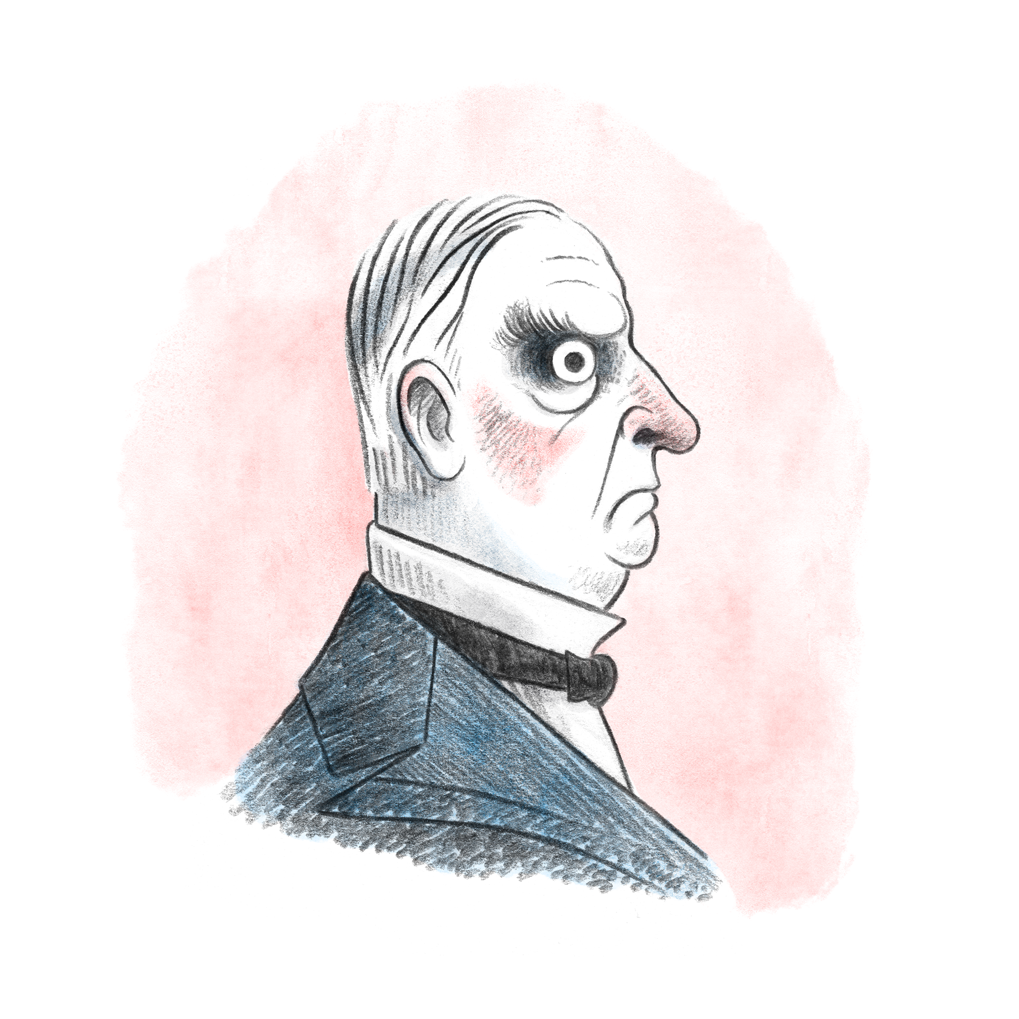
As a creative exercise on Instagram (before I took an IG hiatus), and to try out a bit of a new style, I decided to draw a president a day as a countdown to the 2020 election. Here are all of the presidents, including Mr. Biden. Democrats were blue and Republicans were red. Left-leaners faced left while conservatives faced right. Categorizing presidents in this way proved to be a slightly difficult task, but we made it work. If you want to see how the project played out in real time, check out @samuelricks.

Hat Tricks

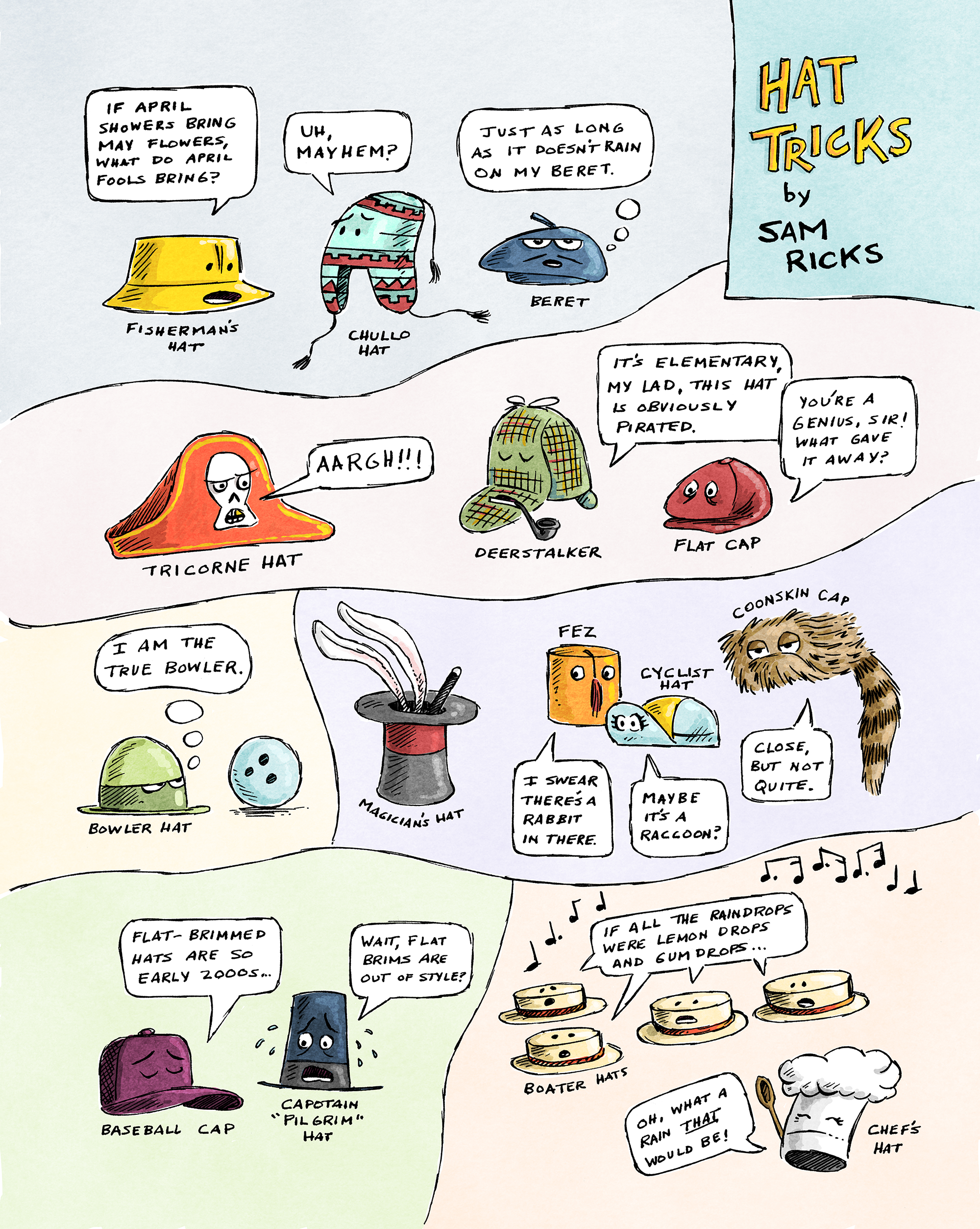
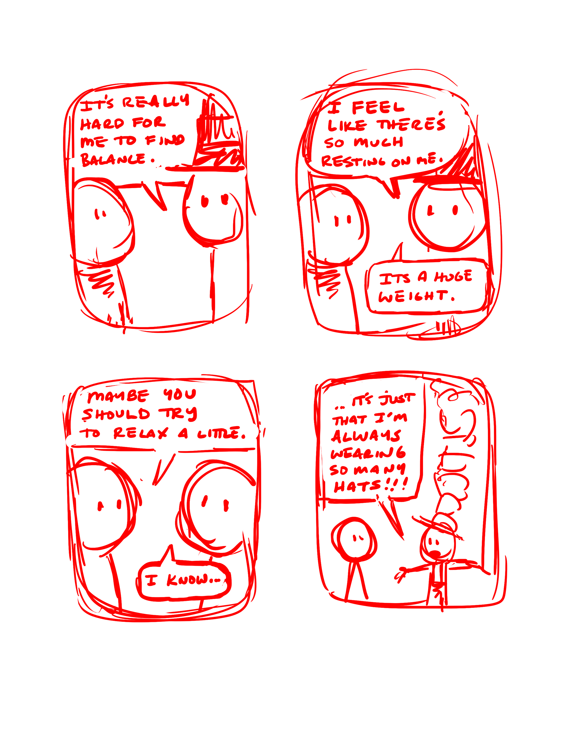
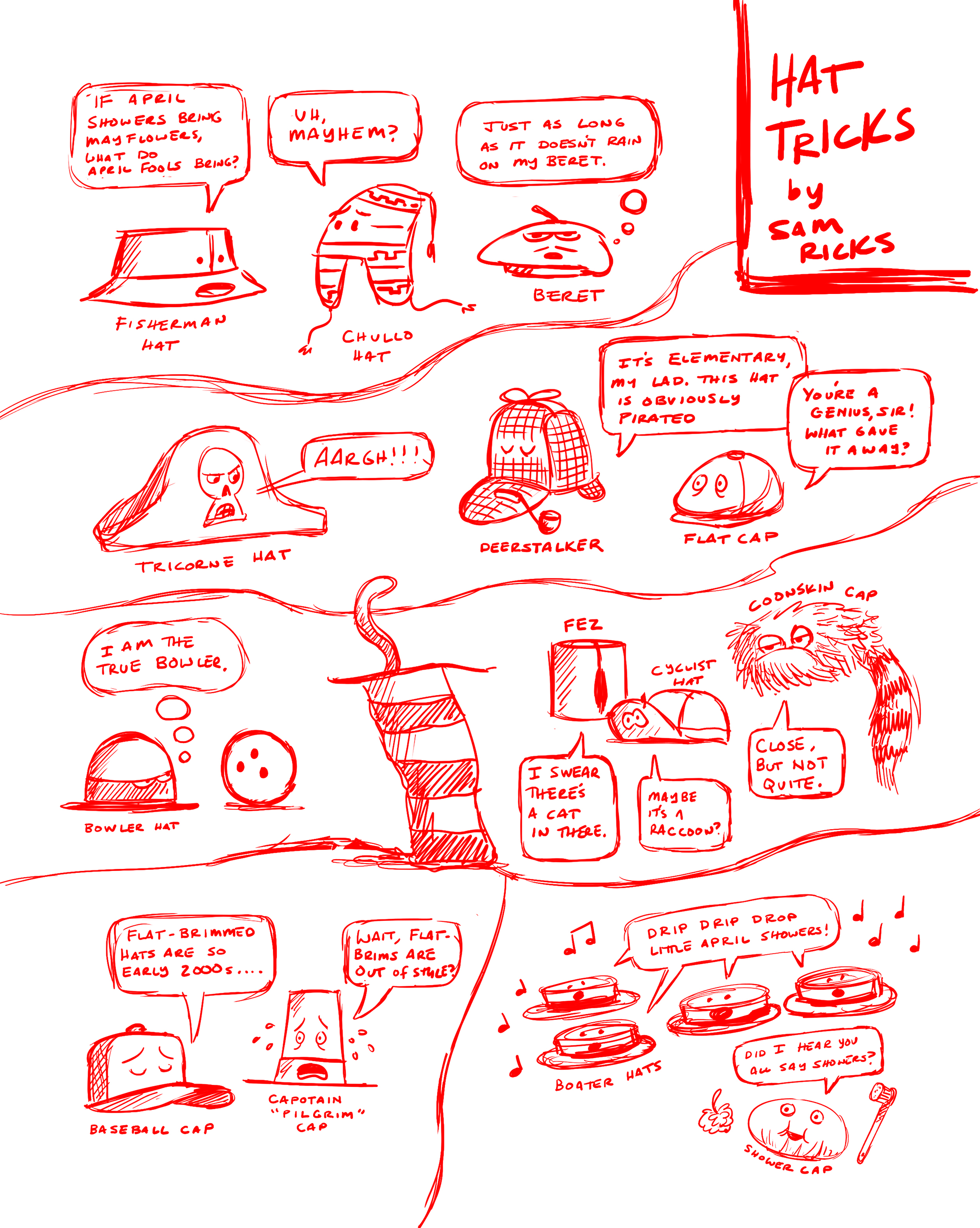
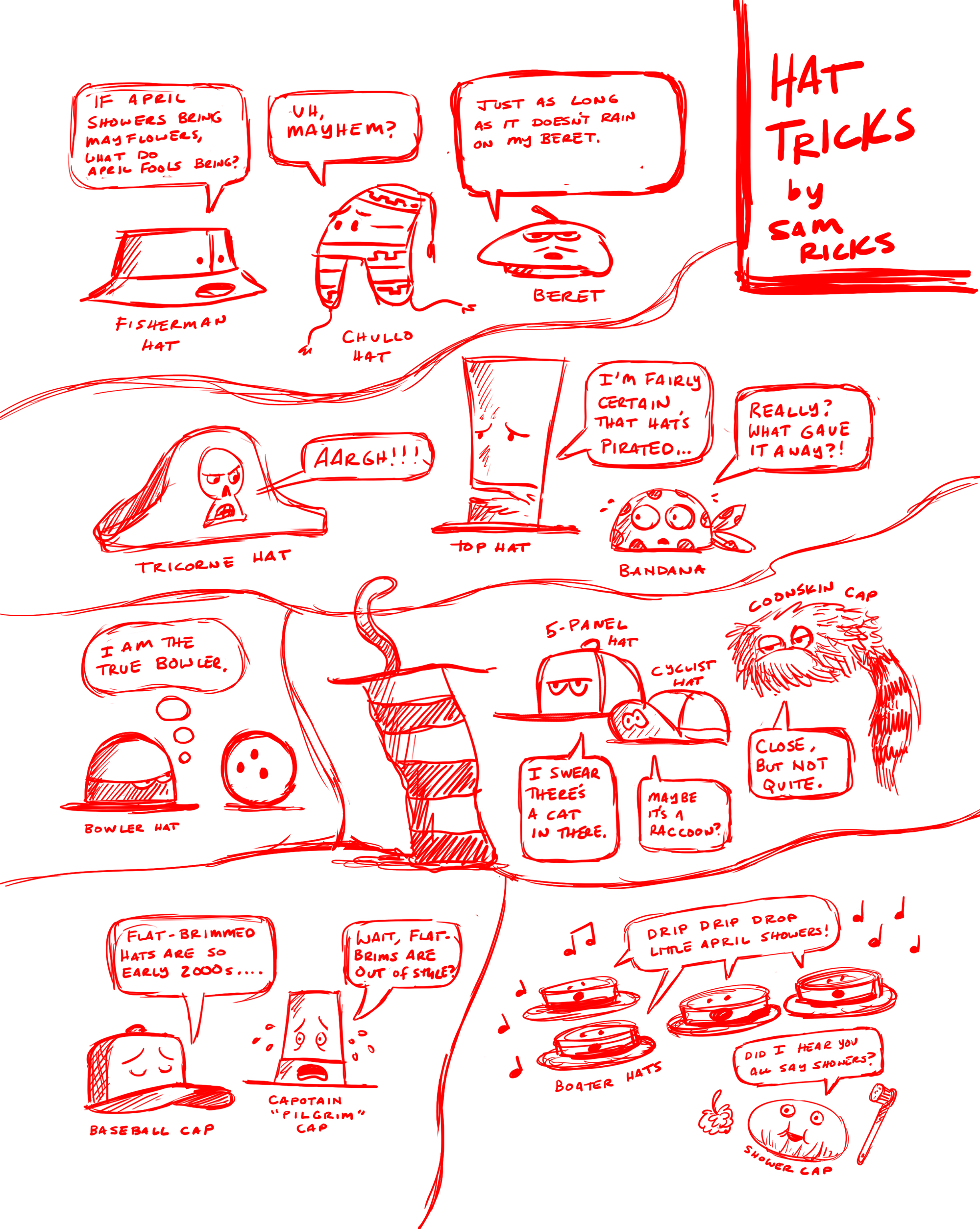
Here’s a fun little comic I did for Spider Magazine’s April Fool’s edition. The art director’s notes: “I’m looking for a one-page, full-color comic, something wacky and fun with a low word count. Slapstick humor is fine, but no malicious violence….The piece doesn't have to be a story—it can be a visual gag or joke using four panels or more….The April themes are: April Fools, peacocks and funny hats…”. Below are a few of the rough sketches. You’ll see the Cat in the Hat didn’t make the final cut. Copyright issues.

spider-color.png

Resolved

I’ve been giving a lot of thought to whether I should start up my blog again. I know, I know—nobody reads blogs anymore. But I’ve dabbled with Instagram over the years, and while I think IG is fine, I can feel its gravitational pull to mindlessly use it to excess, and I find there’s a lot of pressure (imagined or otherwise) to produce for it. For whatever reason, I also feel the work I publish on IG needs to be more polished, and I dislike that. I want to be able to talk about and share my work without commentary—more as a creative exercise for myself than as a showcase.

Also, I’m trying to write more. I’ve illustrated more than 25 books at this point, which is great, but I want to write my own stuff, so I need the practice. This year, I’m hoping to write my own book. I say that every year but haven’t really pushed myself to do it. 2021’s gonna be the year.

And so, after a prolonged hiatus, I’m going to start posting again.

Dino

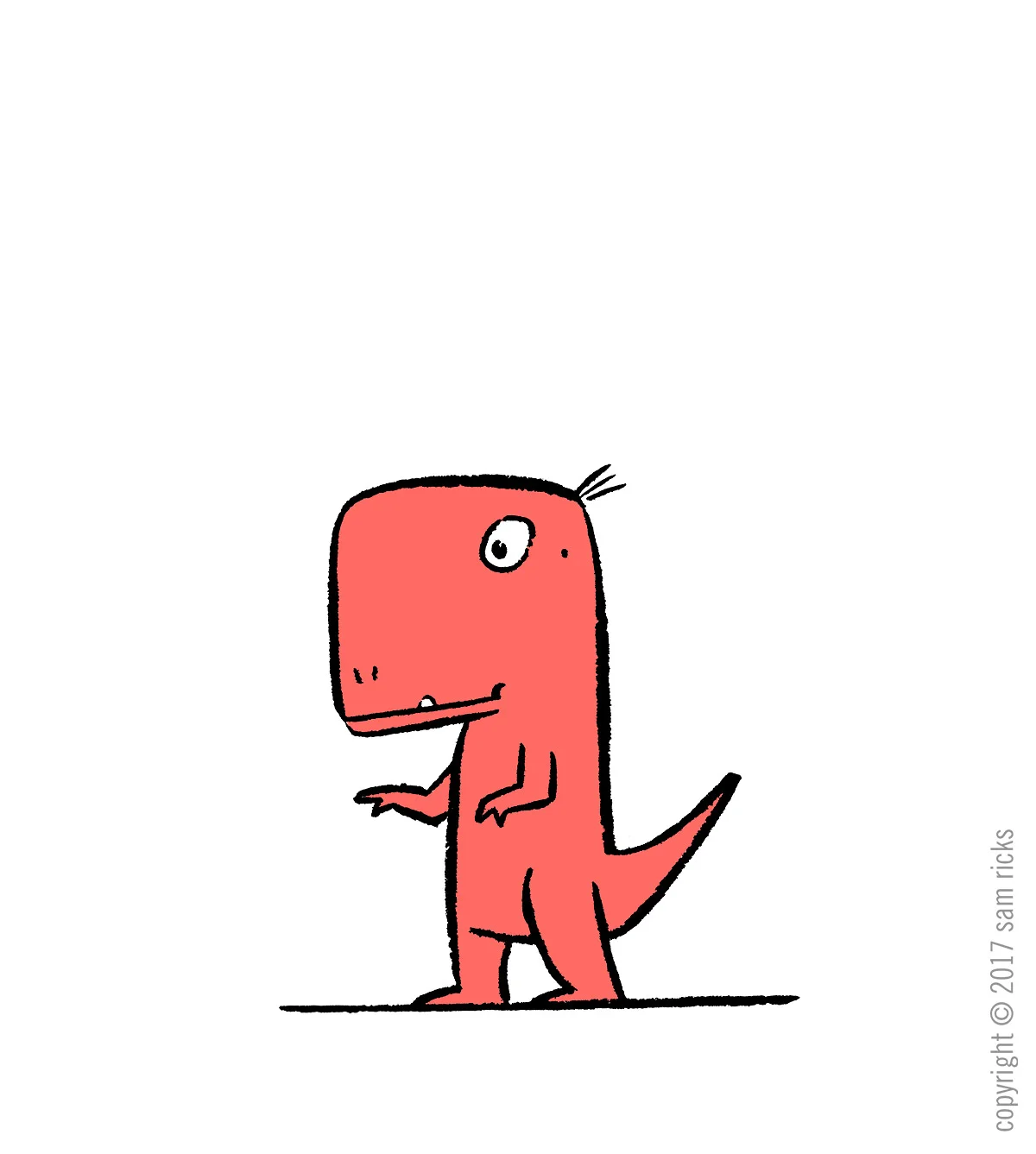
My schedule's gotten slightly less crazy. So here's a dino to celebrate!

dinosaur.jpg

Sam Ricks 2016 Geisel Award Speech

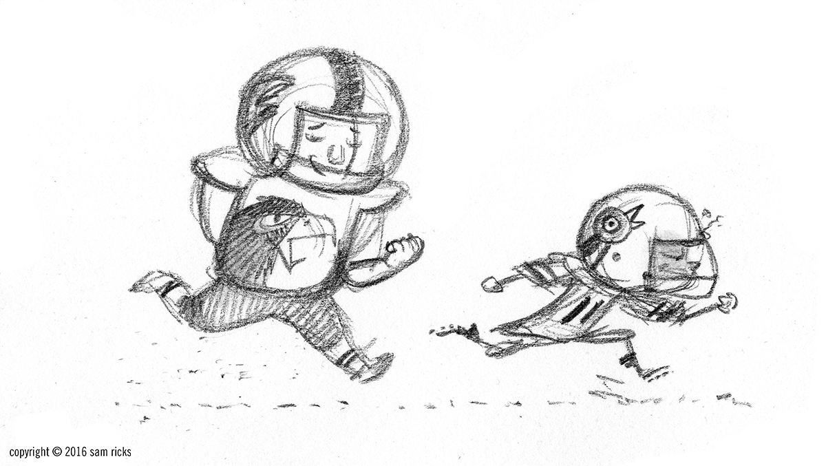
I know it’s been a while, but I thought I’d finally publish my speech from the Geisel Award Ceremony at the ALA Convention in June. Here it is, along with a few pics for good measure.

running.png

Thanks, first off, to my wonderful wife, Janae. She made the trip out here nigh unto nine months pregnant, despite my protests. Janae insisted on coming, stating that this was the Oscars of children’s books. “The Geisel is the biggest award you’re ever going to get,” she said, “so, you’d better let me come!” I’m glad she’s here, and I love her for it, but I still worry that she’ll go into labor in the middle of my speech.

Congratulations to David Adler, Jonathan Fenske, Kevin Henkes, and Steven Savage. Your talents inspire me. I’m still uncertain whether I’ve done anything that warrants Dr. Seuss’ likeness on the cover. All the same, it’s a joy to be here.
I’ve always loved film, illustration, and writing. In second grade, I wanted to be Arnold Lobel. In fourth, I wrote a letter to Chris Van Allsburg telling him how much I idolized him. In middle school, I geeked out on C.S. Lewis and Tolkien. In high school, I wanted to be like Peter Weir and Stephen Spielberg. Later, I discovered Mary Blair and Lane Smith, William Steig and Quentin Blake—artists I’d neglected as a child. I realize now that what I wanted all along was to tell a story—to share the power of make believe with other people. So, maybe I just wanted to be a combination of LeVar Burton and Mr. Rogers.

I’m not there yet as an artist, though if my wife’s prophecies hold true, I may have already peaked. This might be my Orson Welles/Citizen Kane moment. Still, I relish the idea of creating books that evoke wonder, that speak to kids where they are, and that say something meaningful (though not necessarily seriousful). I hope the future will let me make things that stand the test of time, even if I never get another gold sticker.

Thank you to the Geisel Committee, to Denise Cronin and Kate Renner at Viking, and to my agent, Minju Chang. And here’s to all the kids out there like Mo Jackson, who have huge dreams and are just waiting for their big break. Keep moving forward, and magical things will happen.

An idea

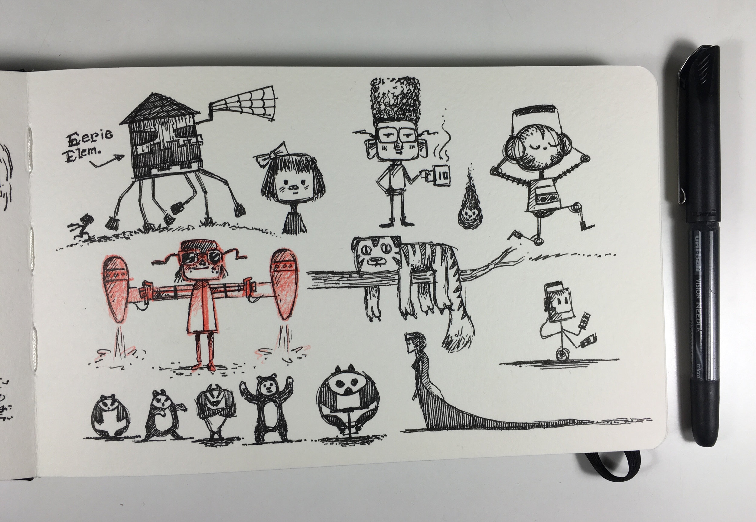
I’m going to draw more consistently in my sketchbook. I’m already drawing a ton every day, but usually it’s for client work, and I haven’t been sketching for the pure enjoyment of it. I’m going to keep one sketchbook and one drawing tool at my desk until I fill the book. I’m hoping that by getting rid of choices and only using one book and one medium, I’ll get into sketching more quickly and increase my creative output. Here’s a page from today.

Happy publication day!

Get a Hit, Mo! is out today in bookstores everywhere, so I thought I’d share a few little sketches to celebrate.

These are the cover thumbnails for the book. I thought the Hamlet idea was pretty awesome, but it didn’t make the cut.

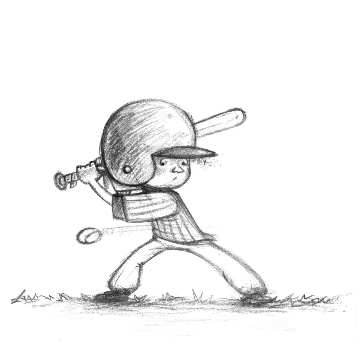
And here are some early rough concepts for Mo’s baseball look.

That’s it for now!

Mo cover sketch

The sequel to Don’t Throw It to Mo! comes out Tuesday, so I thought I’d share a quick sketch from the new book. In this sketch for the cover, Mo was right handed, but as the illustration process continued, I thought it’d be great to switch things up a bit and have him be a lefty.

So Mo’s a lefty throughout the book. In some ways, the leftie thing was a bit of a bummer, because I wanted Mo to be facing right, and the only way for him to do that if he was left handed would be for his back to face the viewer. So, in the final cover he’s facing left.

In the coming weeks, I hope to post more often (even though I have two books due in March, which is making me crazy), and I’ll show some more preliminary work for Mo.

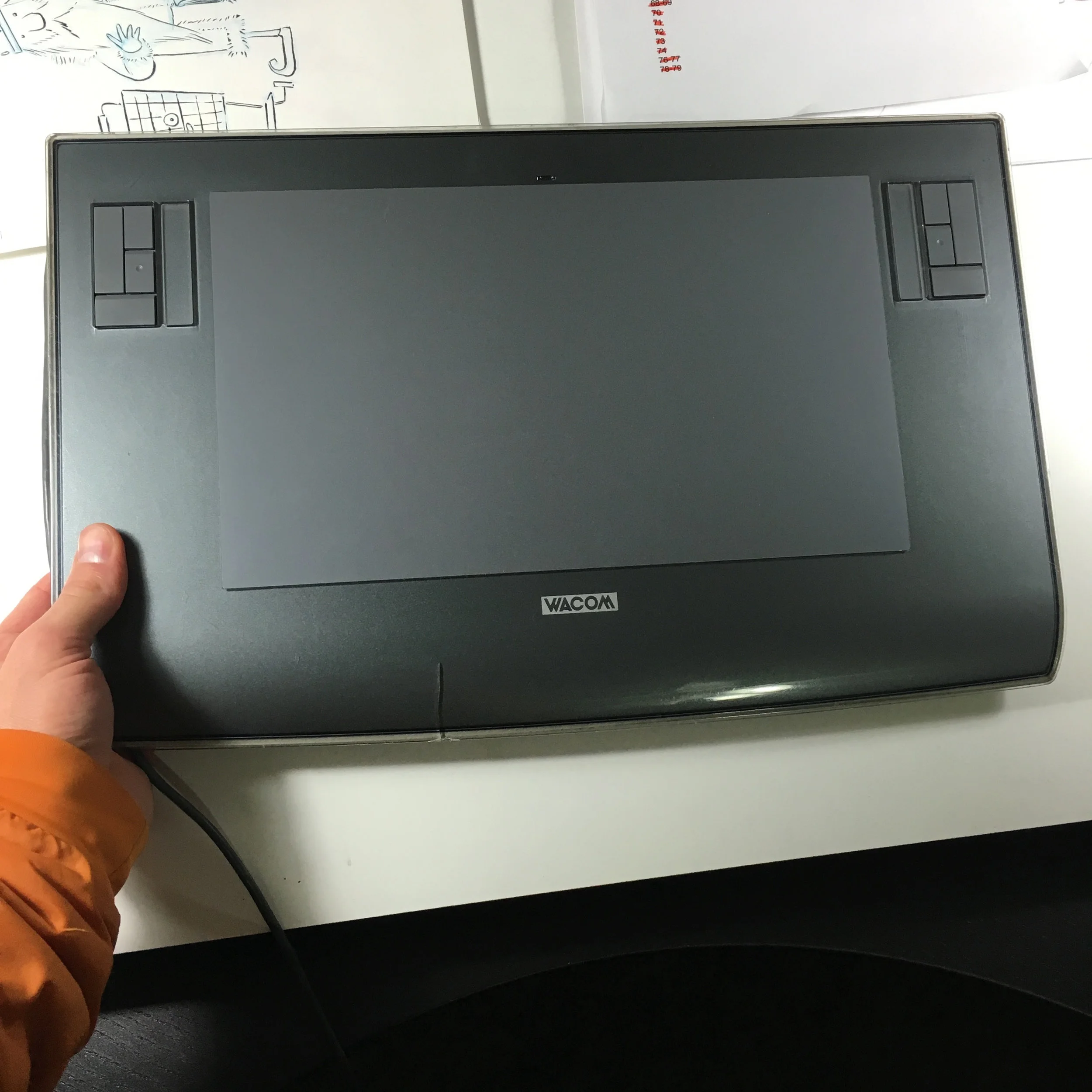
Goodbye, tablet

Born 2006. Died 2015. Trashed 2016. You were good to me. I seriously can’t believe this thing lasted me this long.

More Dark Lord Stuff

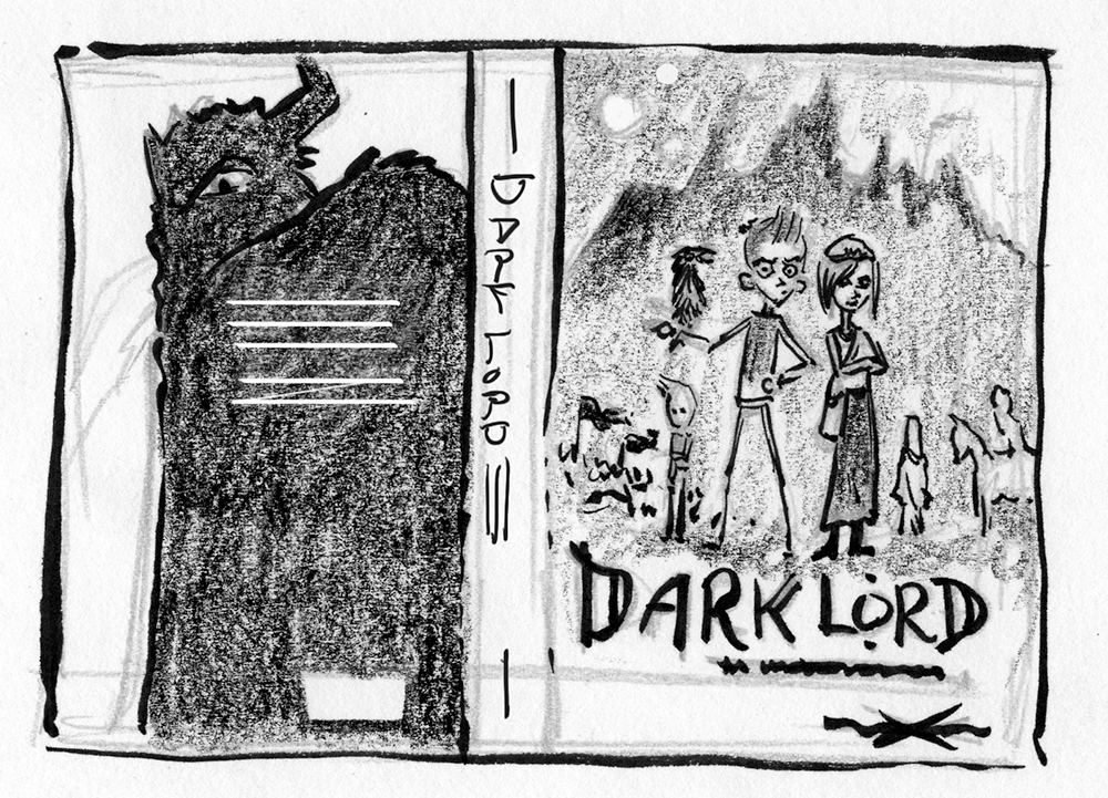
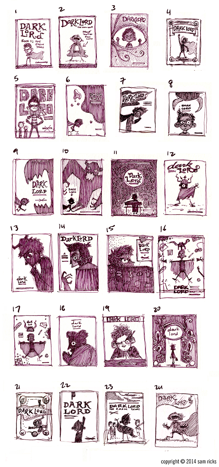
After a long silence, more stuff! Here's some more imagery from the covers I did for Bloomsbury's Dark Lord series. If you haven't picked it up, it's a really fun maniacally awesome read.I don't have any amazing commentary on this, except that I'm still trying hard to make my final illustrations as lively as the sketches.

cover1.png